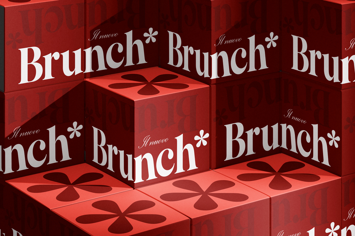
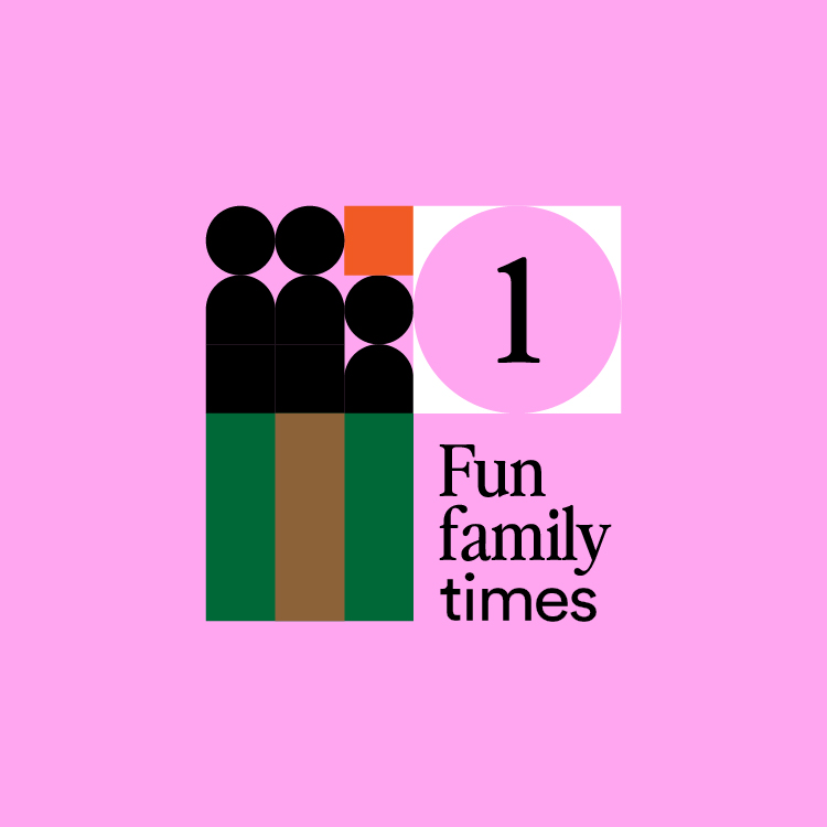
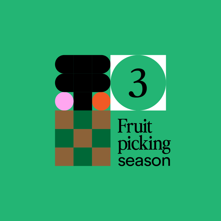
The New Brunch*
The New Madreperla Bistrot Brunch* is fun meets elegant, pop meets classic. Photos play a huge part of the brand, but plain colours balance their busyness to create the warm inviting feel of the New Brunch*.
Check out the project here.
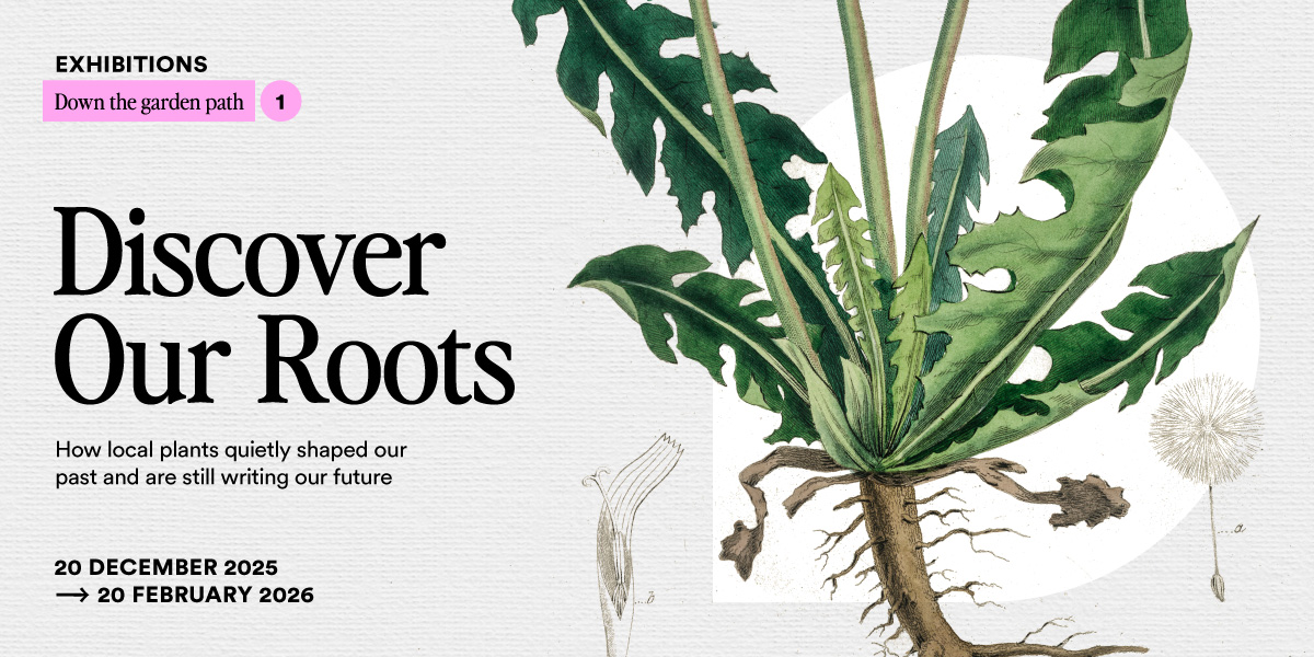
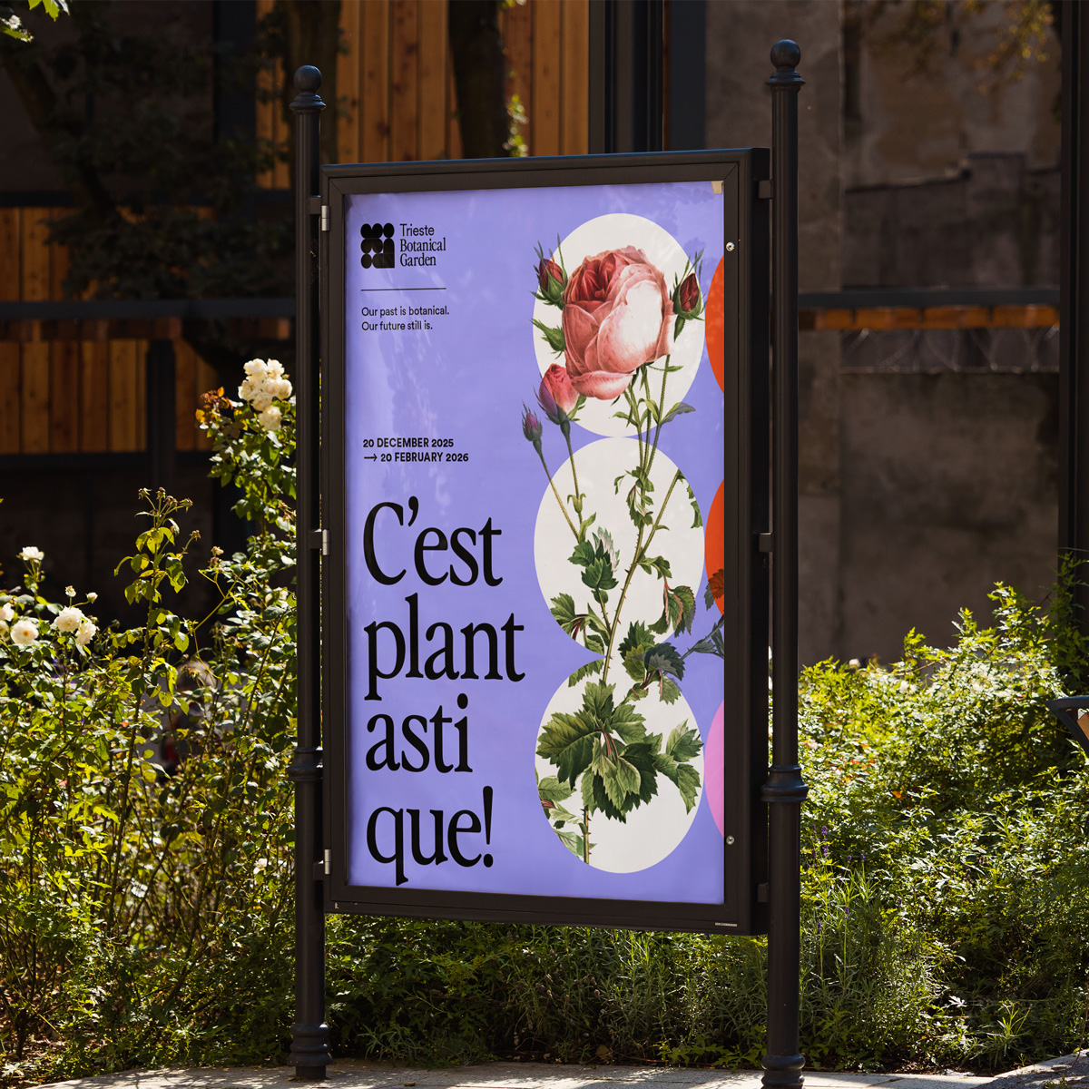
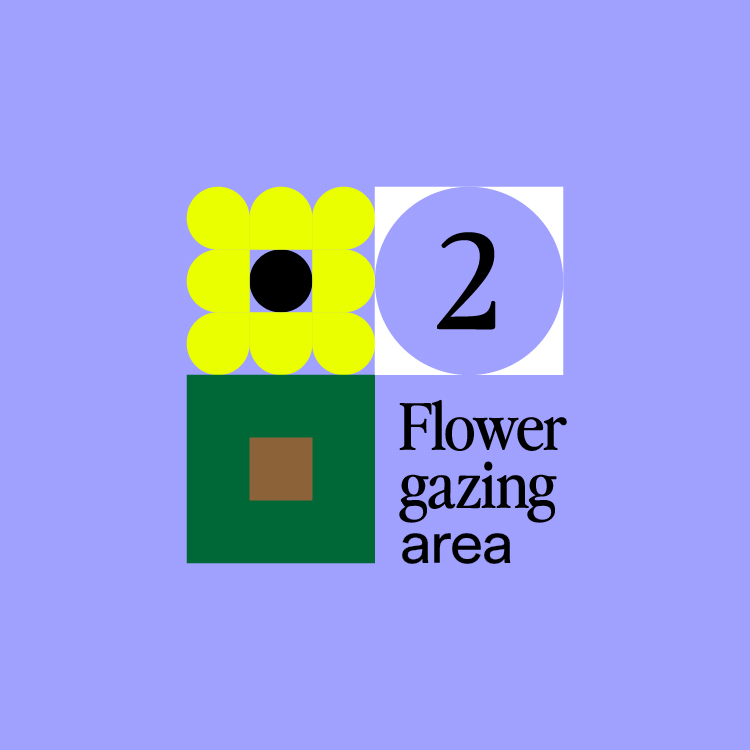
Trieste Botanical Garden
Trieste Botanical Garden is a personal project for a fictional botanical garden in my hometown. Check out here the full project.
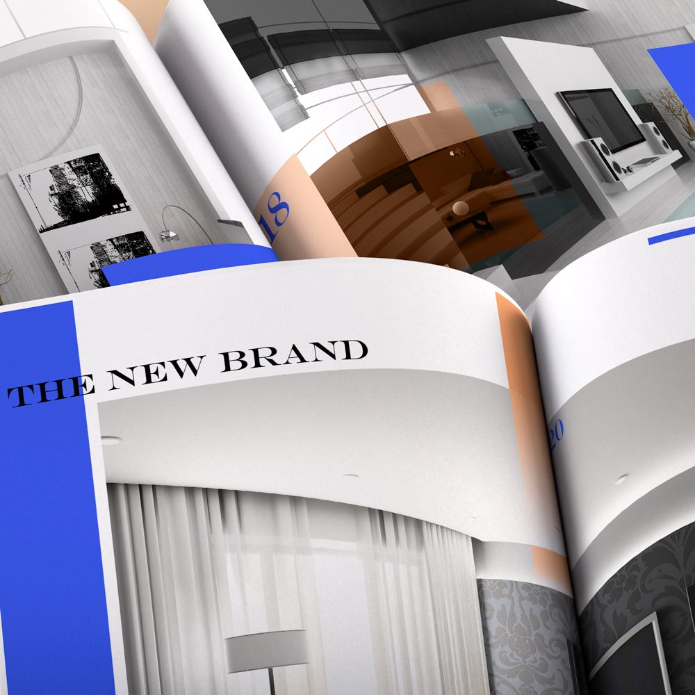
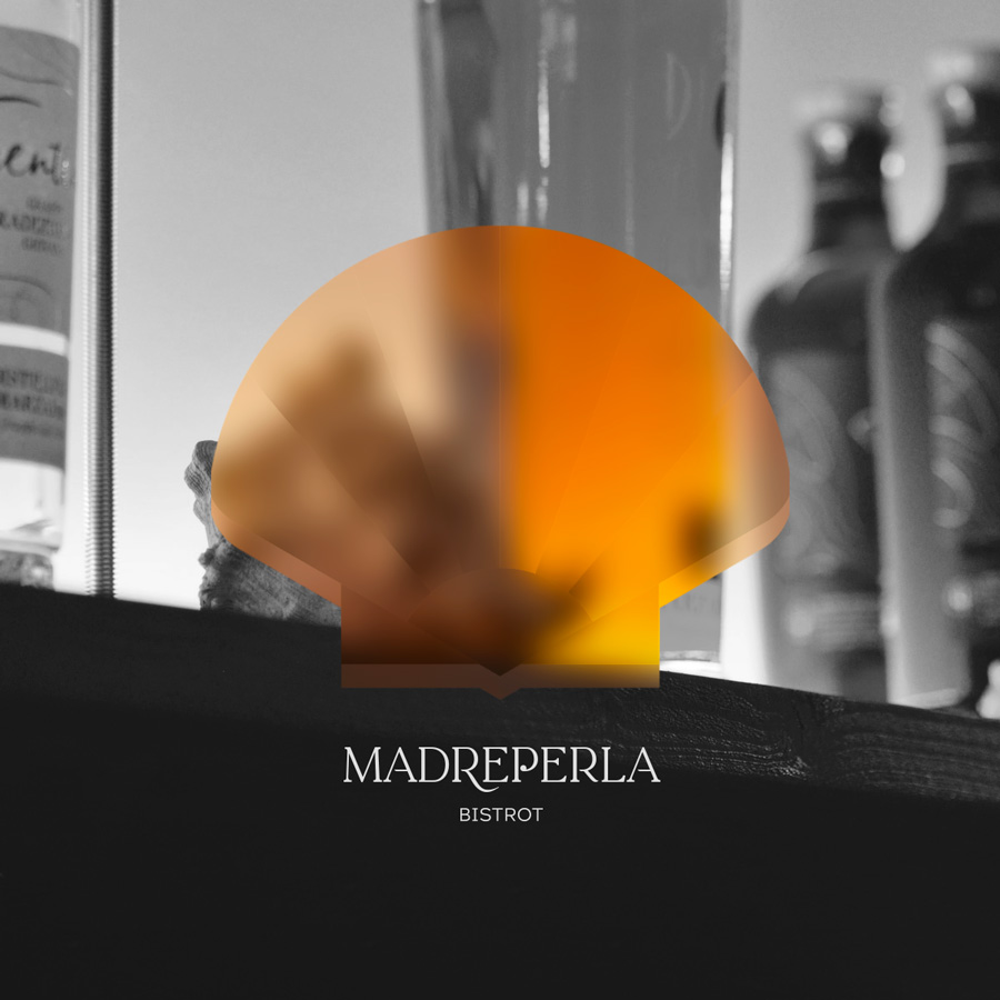
Madreperla Bistrot
Madreperla Bistrot is an elegant little restaurant in Trieste, Italy, specialised in seafood. The bistrot is owned and run by Dunya and Ned and it combines their respective love for décor and seafood. Here to find out more about the full project.

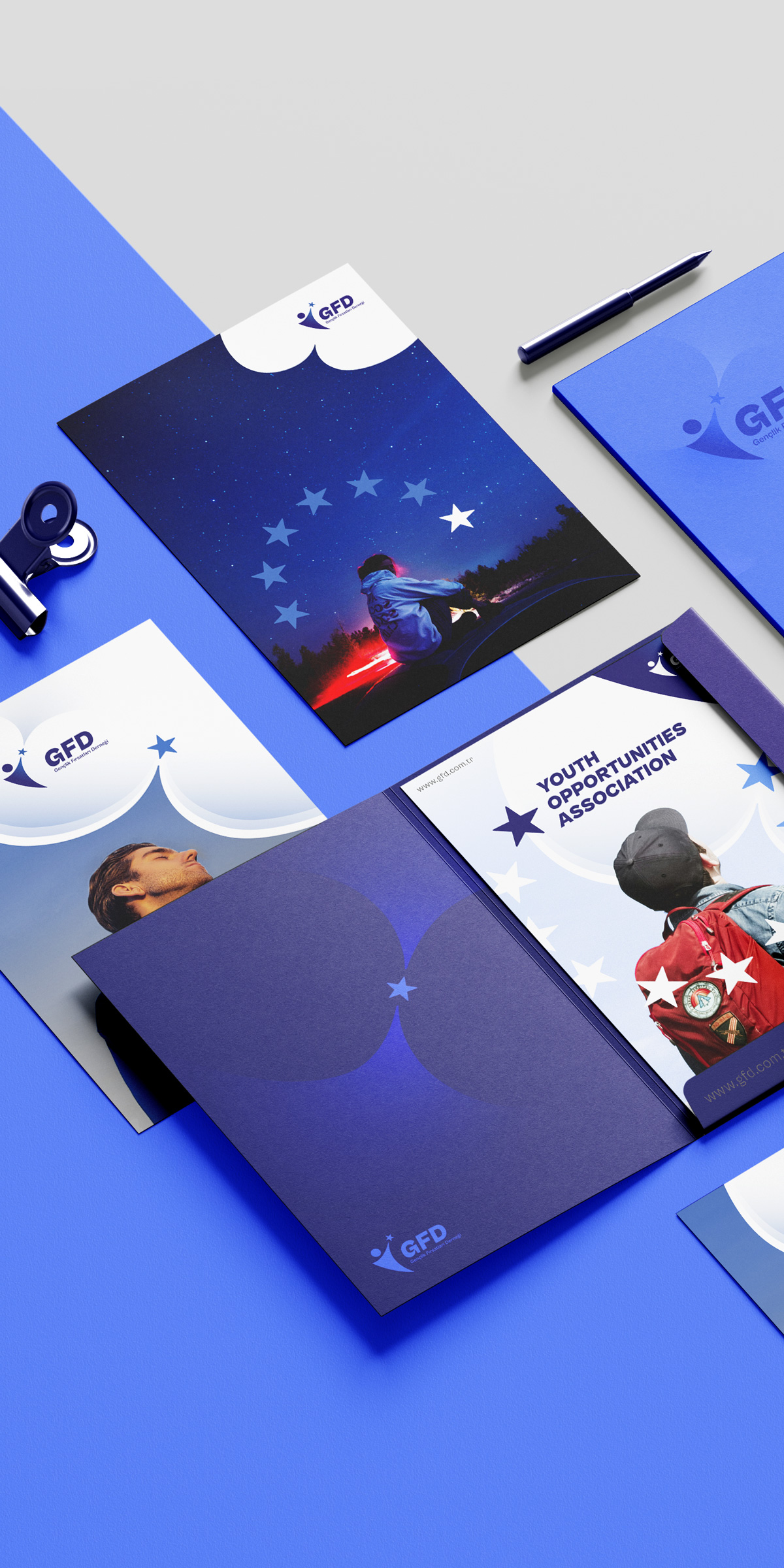
GFD youth organisation
GFD is a Turkish organisation focused on creating learning and job opportunities for young people in Turkey. Its values are the European values and its goal is to be a bridge between the world and the young, as highlighted by their brand. Check out here the full project.

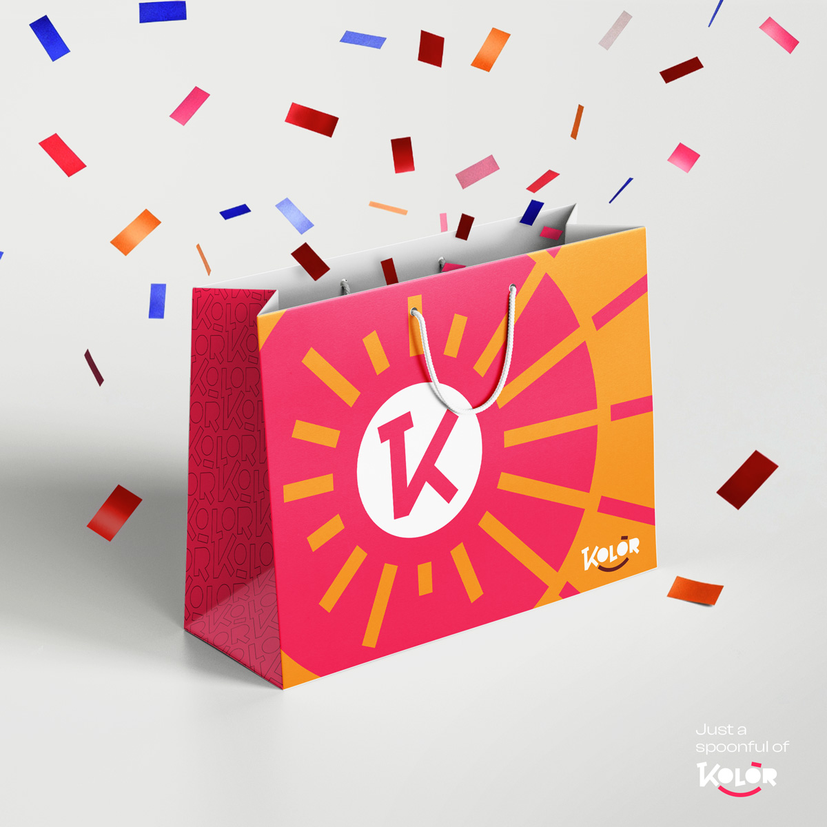
Kolòr
The Kolòr brand is fun. It brings together colours, curves, smiley faces and everything you look for in a clothing store. Check out here the full project.
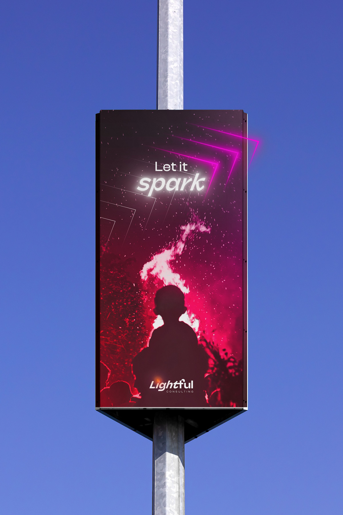
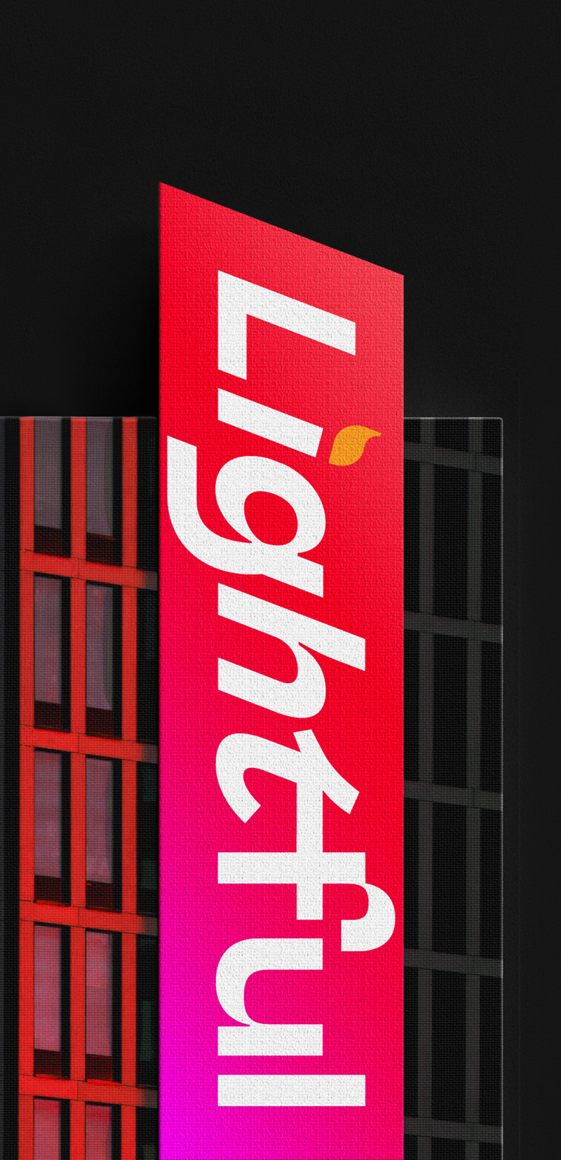
Lightful
Started as a commissioned job, Lightful then took life of its own. Lightful is a consulting company that helps companies grow in many ways: Risk management, Digital transformation, Restructuring and much more. Check out here the full project.

Scala
Scala is a construction company and its tone is serious, without being any less modern or daring.
The brand is an experiment with a very limited palette and, above all, textures. Check out here the full project.

Alessio Pennati
Alessio Pennati is an Italian DJ specialised in house music.


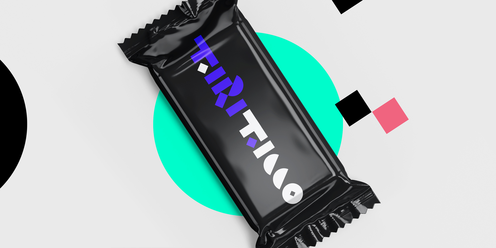
t21 rebranding
In a few years I had changed soooo much, personally and professionally. And knowing how fundamental it is for a brand to really reflect the product, the company or, in this case, the person, I knew that my personal branding needed a deep overhaul. Check out here the full project.


Glob!
GLOB! is a modern London bar that offers a variety of exclusive coffees and unique cocktails. Here to find out more about the full project.

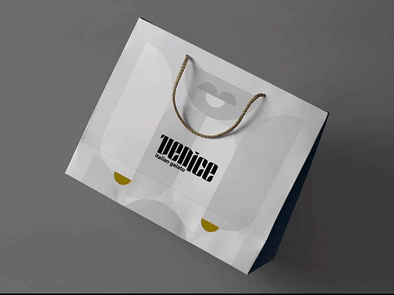
Venice
VenICE is a gelateria in Venice, obviously. The brand is elegant and modern, albeit clearly referencing a very classical style and a constructivist use of simple shapes. This callback helps the brand stand out against touristy or tacky ice cream shops.

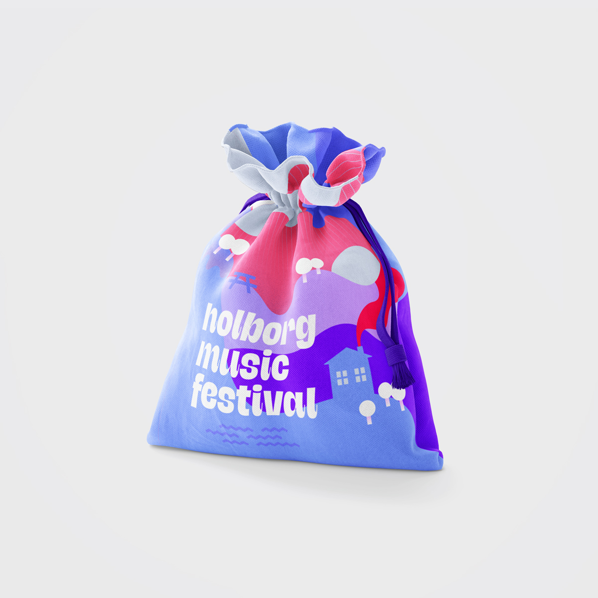
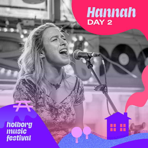
Holborg Music Festival
For this fictional festival, shapes are a huge part of the brand. They highlight the lively, artistic, childlike, positive and almost psychedelic nature of the festival. Check it out here.


—On the spot
—ON THE SPOT is an Italian billiard and games bar/pub.
With this brand, I wanted to play with the action and movement that goes on in the pub and that differentiate it from the rest.

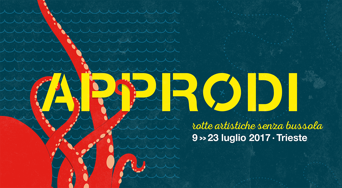
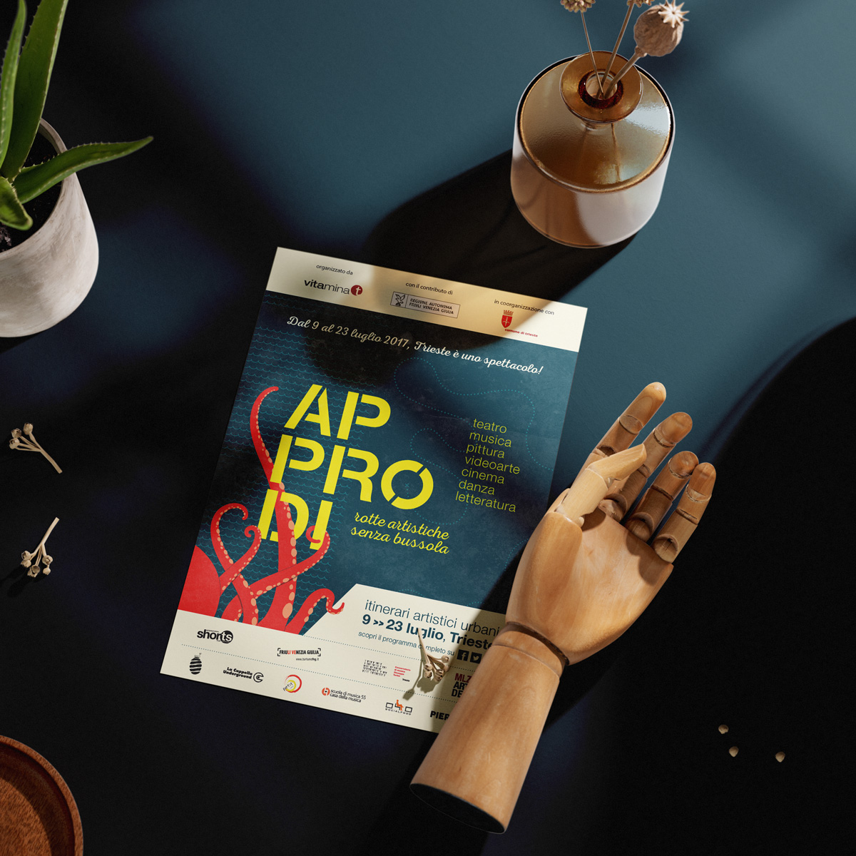
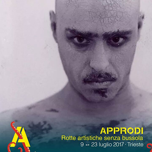
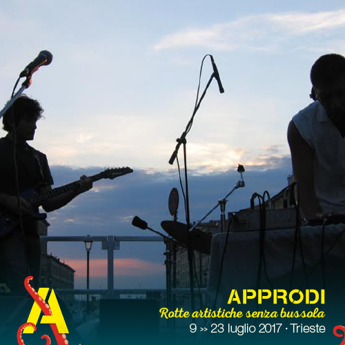
Approdi festival
For this fictional festival, shapes are a huge part of the brand. They highlight the lively, artistic, childlike, positive and almost psychedelic nature of the festival. Check it out here.

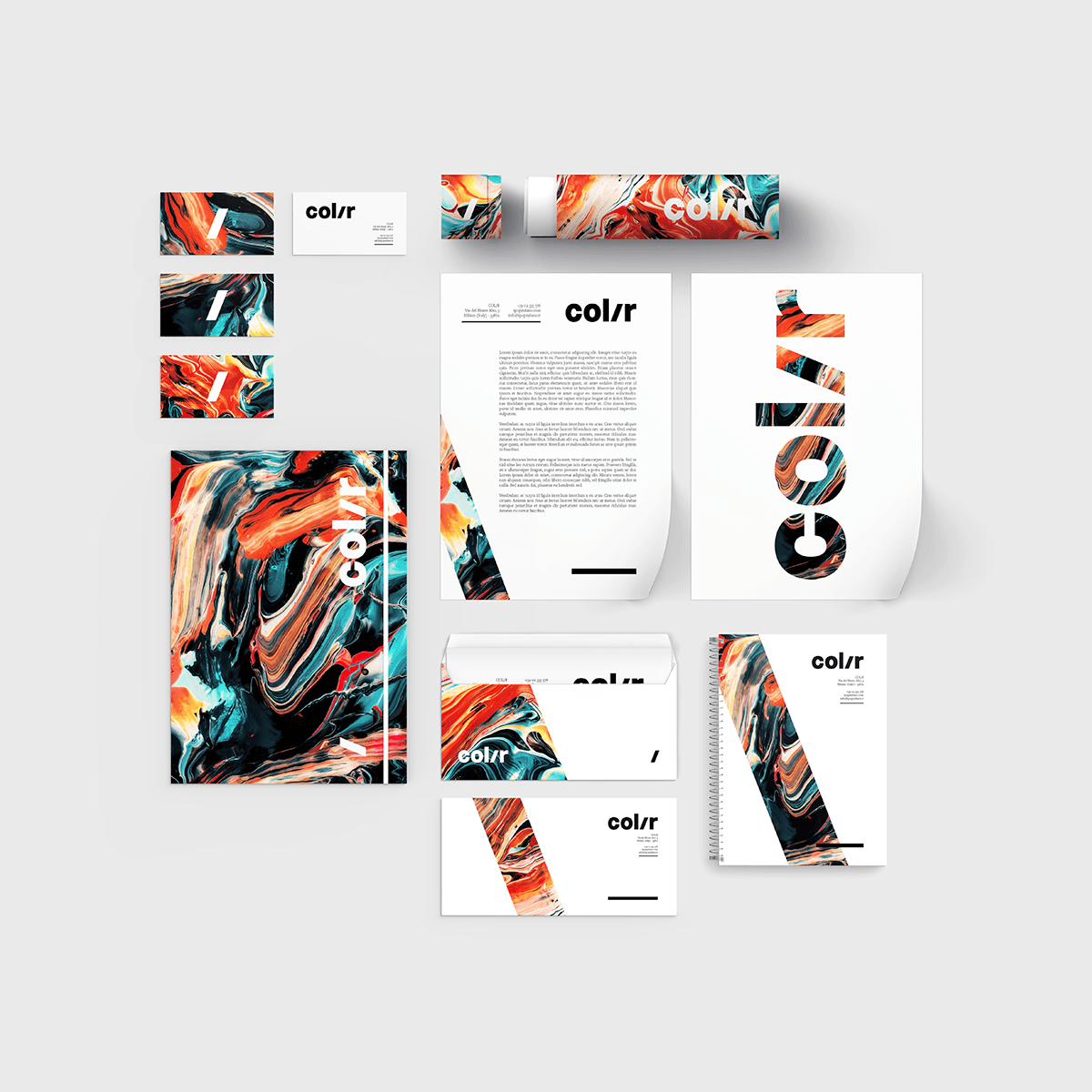
Col/r
A personal project for a soap shop. Not much to say about this brand: the colours speak for themselves. Minimalism meets fluid complexity.
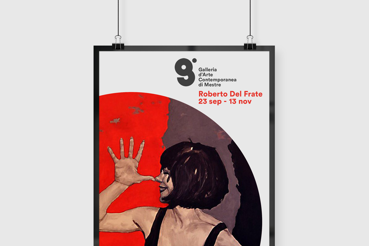
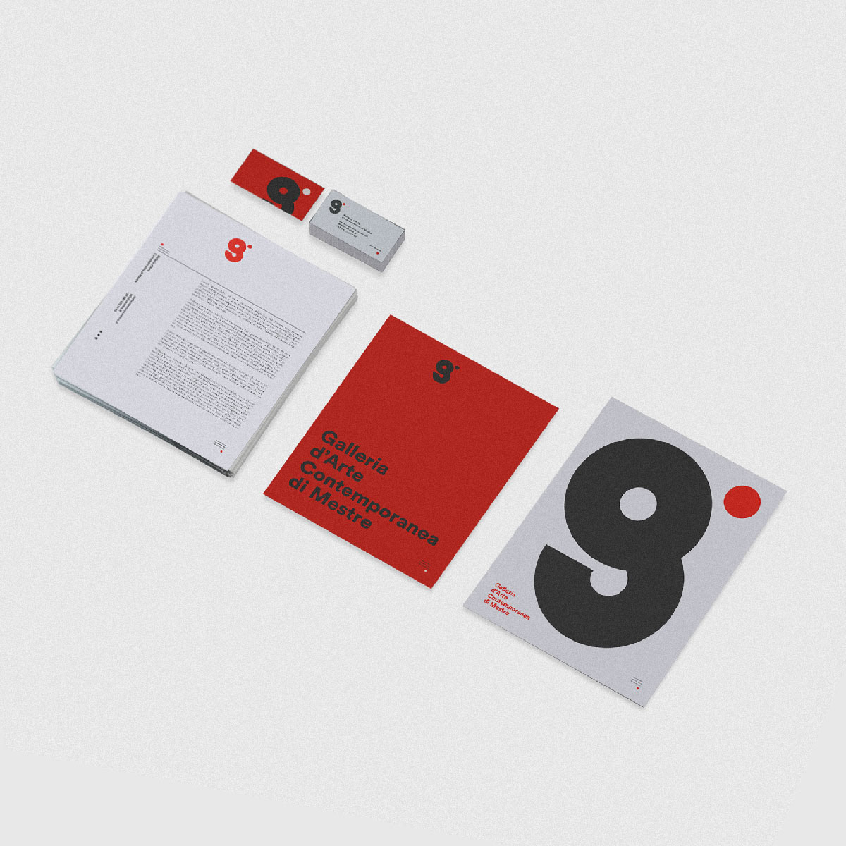
GACM
Realized for the art gallery of my home town, its design had to be minimal to avoid it overshadowing the artworks the gallery would exhibit.
Chladni
Chladni Pictures is an american company providing videos for web and internal communications. Check out the full project here.

Fausti
Designed for R. Fausti, an interpreter, the brand has one of my favourite logos: the R and the F are clearly visible and the upper part forms a chat balloon, representing the communication and speaking interpreters do.


Saxon
Often a financing company needs to have a professional and clean look without looking old or too cold. For the Saxon brand, shapes and graphic elements are meant to give fresh energy to the brand while the colours and typefaces are meant to convey stability and trustworthiness.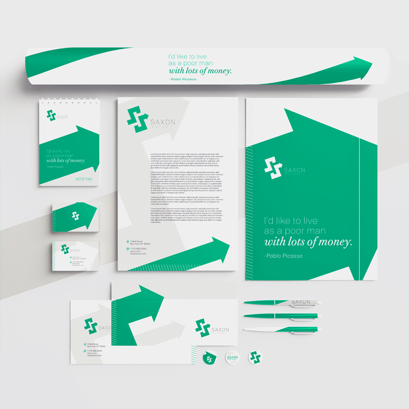
Rebetti
Brand of an interior design store. Elegance and energy are represented by the shapes and the bold colours respectively.