Chladni Pictures is an american company providing videos for web and internal communications.
The name comes from the chladni patterns, shapes that emerge from salt (or rice or whatever) scattered on plates hit by a sound. Each frequency makes a shape. Check out this amazing phenomenon!
The logo
Inspired by the conventional overlapping circles of the RGB colour system and the aforementioned Chladni patterns, this logo is colourful, simple and elegant.


Some of the alternatives proposed to the client.

The brand
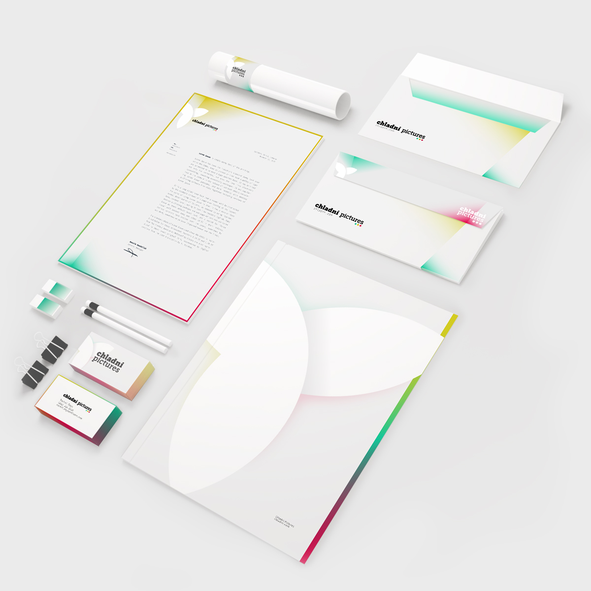
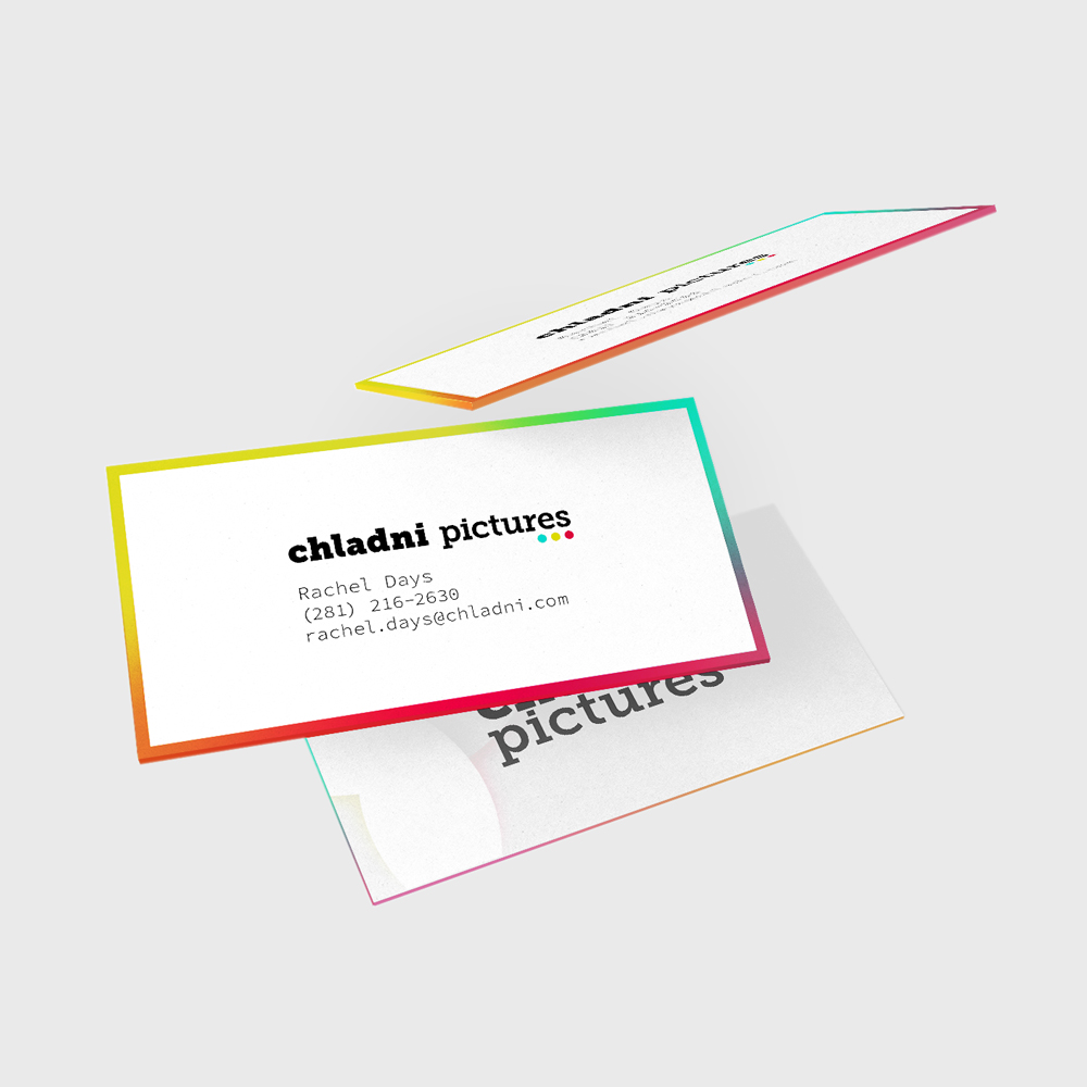
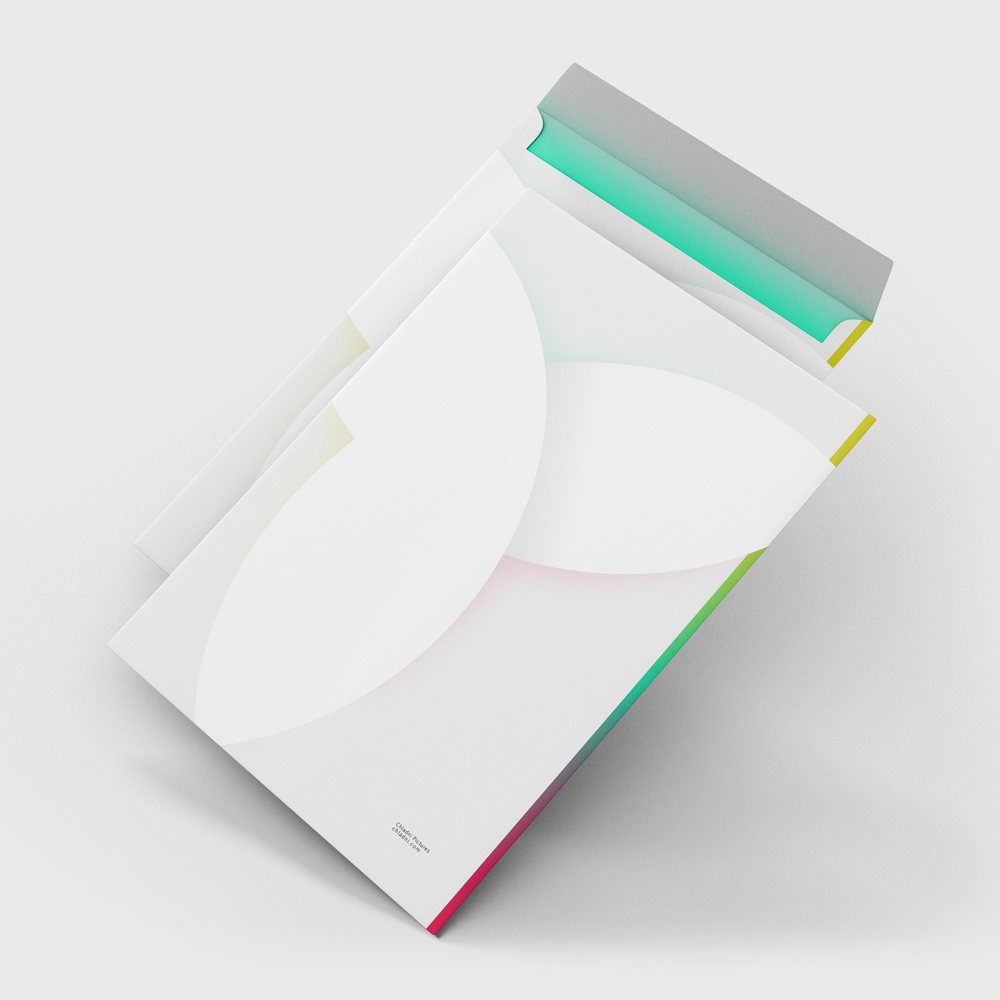
Colour is used in a variety of ways, be it lightly (envelopes, folders) or more heavily (business cards). Colour is the key of the Chladni brand. In some cases, it’s almost left on its own, free from lines and lettering.


Video graphics
Being a video company, the colourful brand had to be adapted for video graphics. Here some examples of how colours and shapes can blend with a photographic element.


