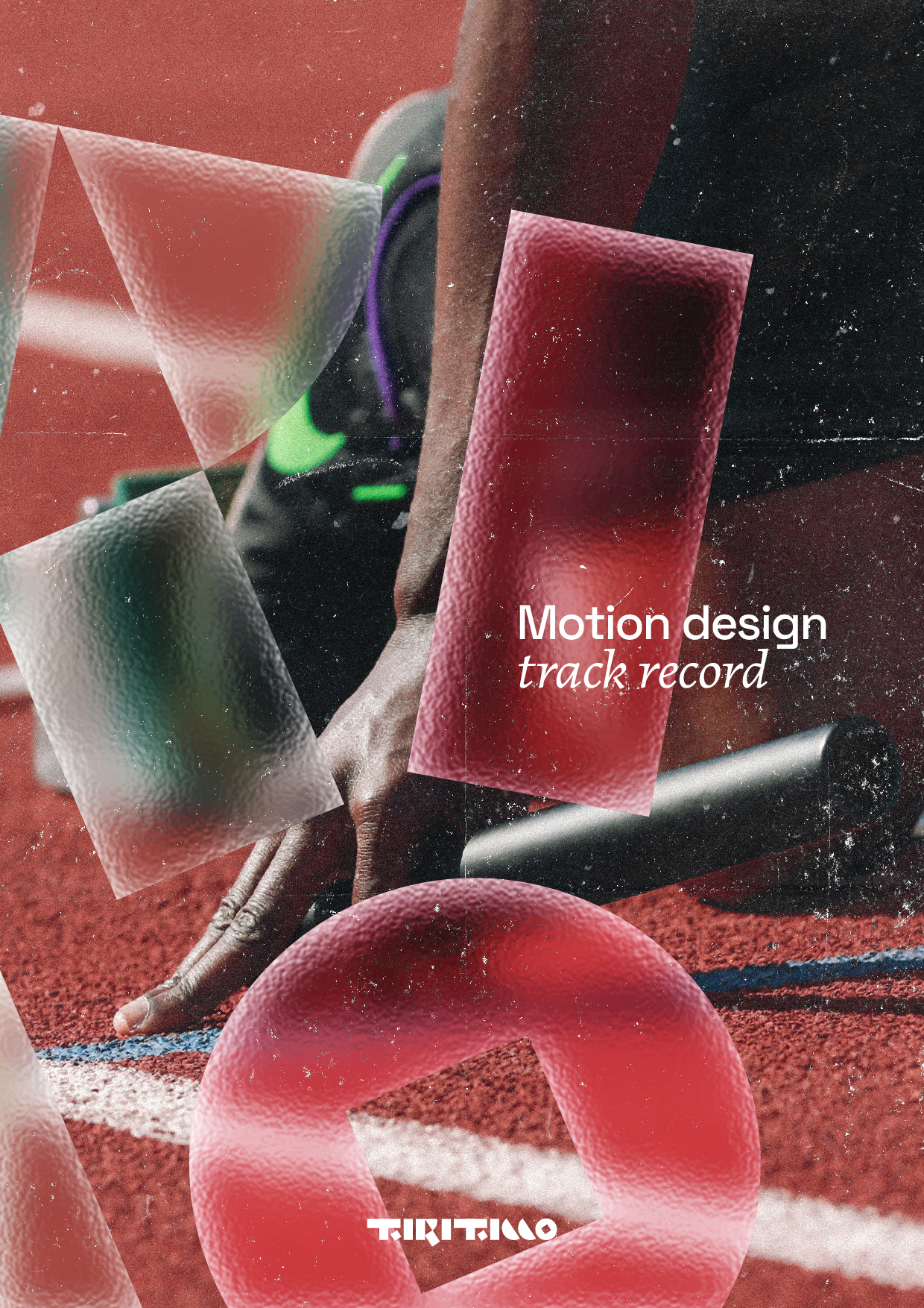
The new
After five years of using the same brand (check it out here), I knew I was ready for this new challenge. The challenge of showcasing the 2026 me and of finding new ways to show the growth of five years, both as a person and as a designer.
So there I was, wondering what needed to be changed and what didn’t. Because this rebranding is not a whim, it’s a refinement. So get ready to be hit with a ton of colours and moving shapes and, hopefully, to be impressed by what the 2026 Lorenzo Tiriticco has to offer. Enjoy!
The logos
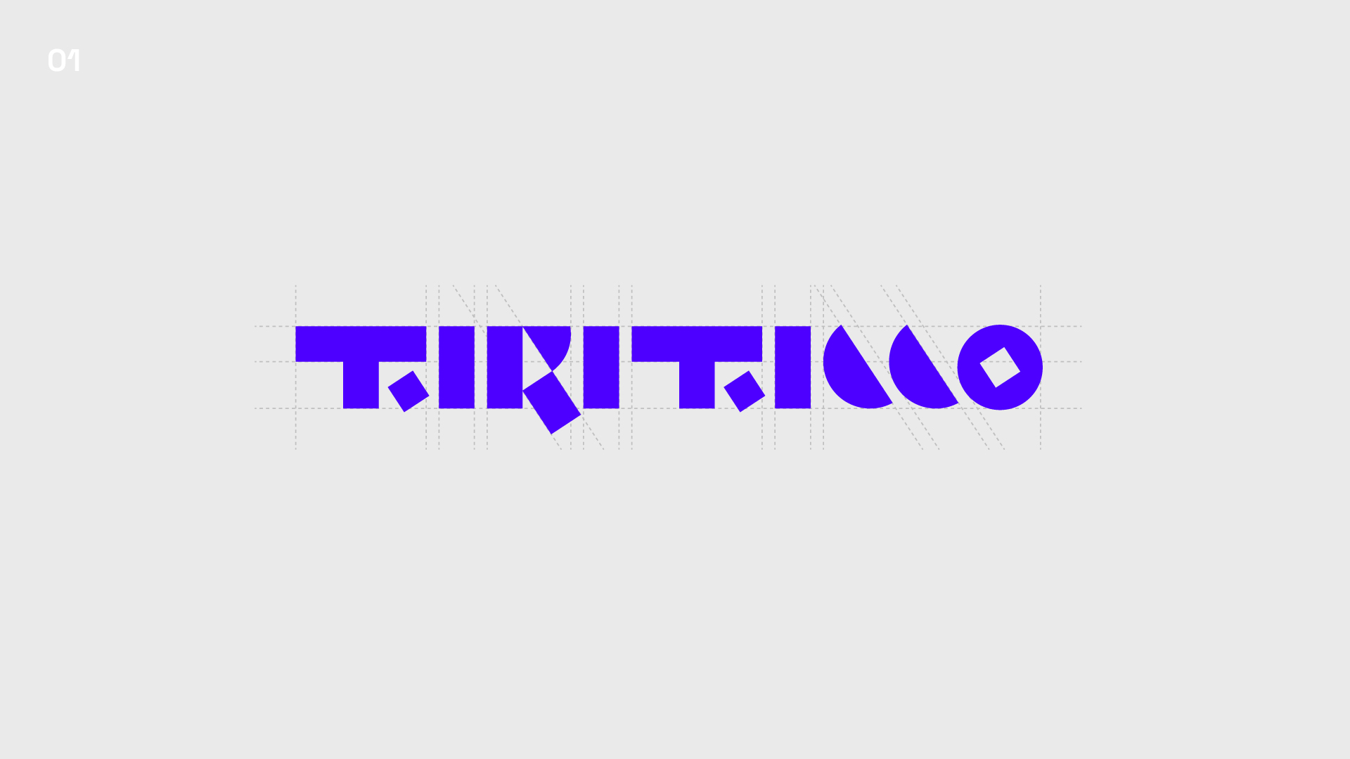
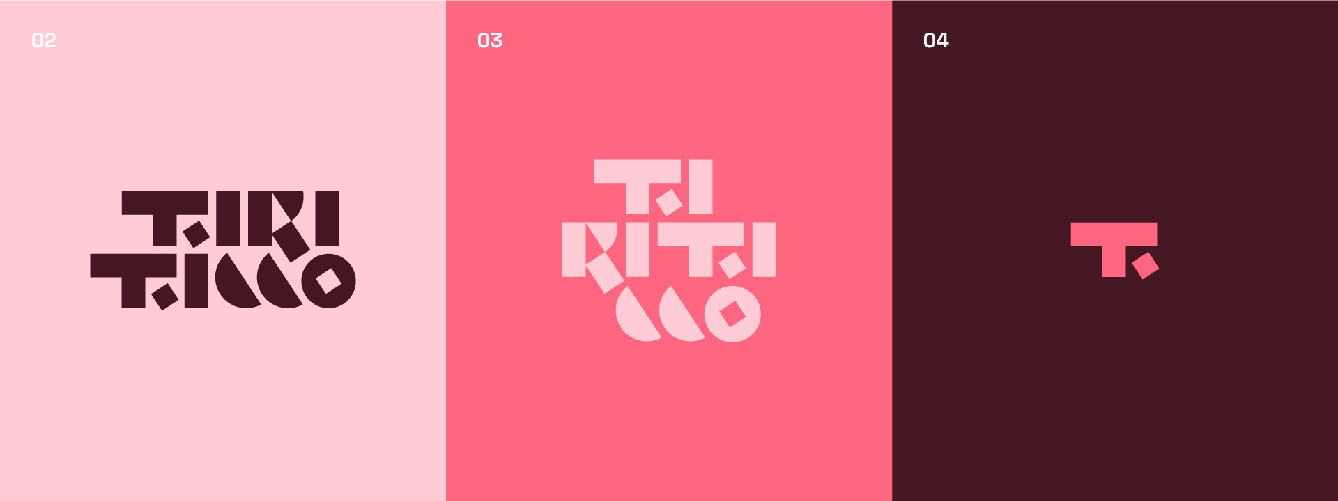
The logo work from the 2021 branding was minimal. More like, non-existent. It didn’t need much, just a cut here and an emboldening there. Both to keep up with the current styles and to tune in the quirkiness. But the biggest fun was with the branding, that you can check out just below!
The brand
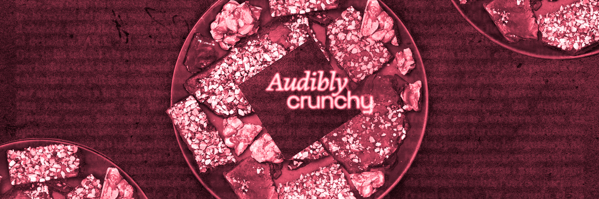
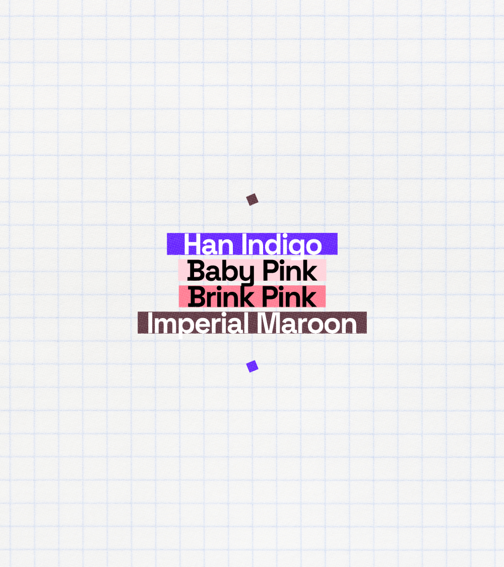
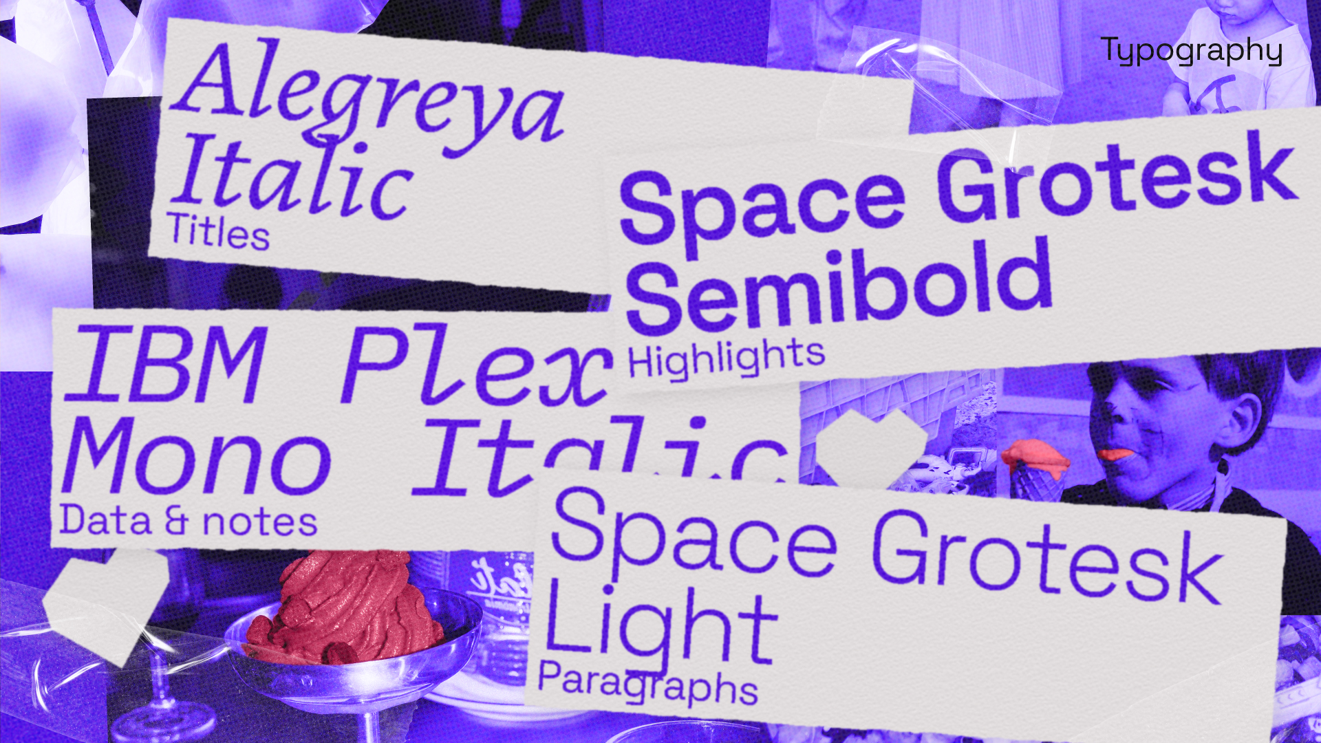
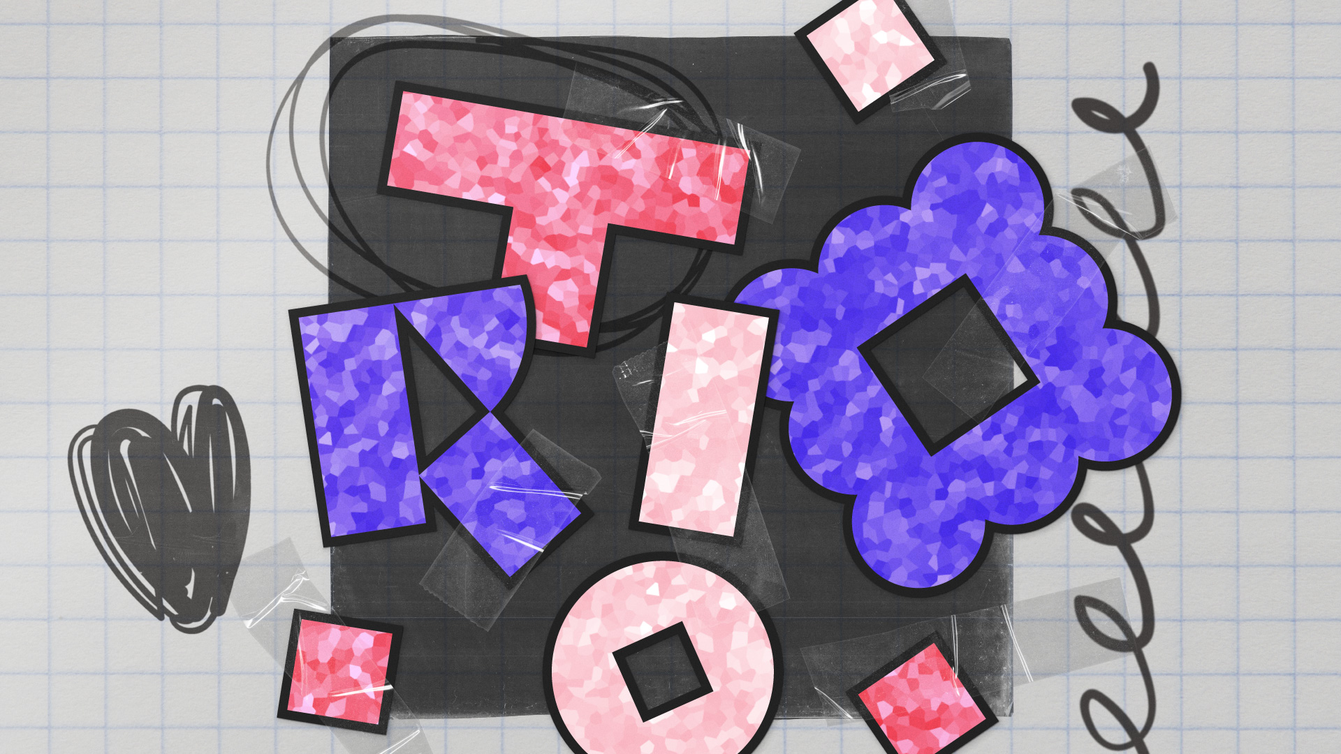
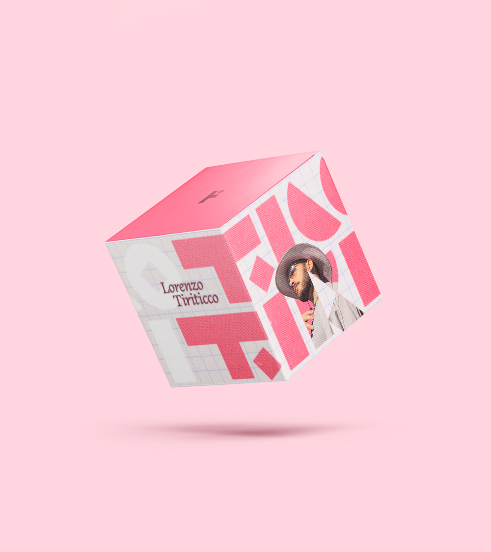
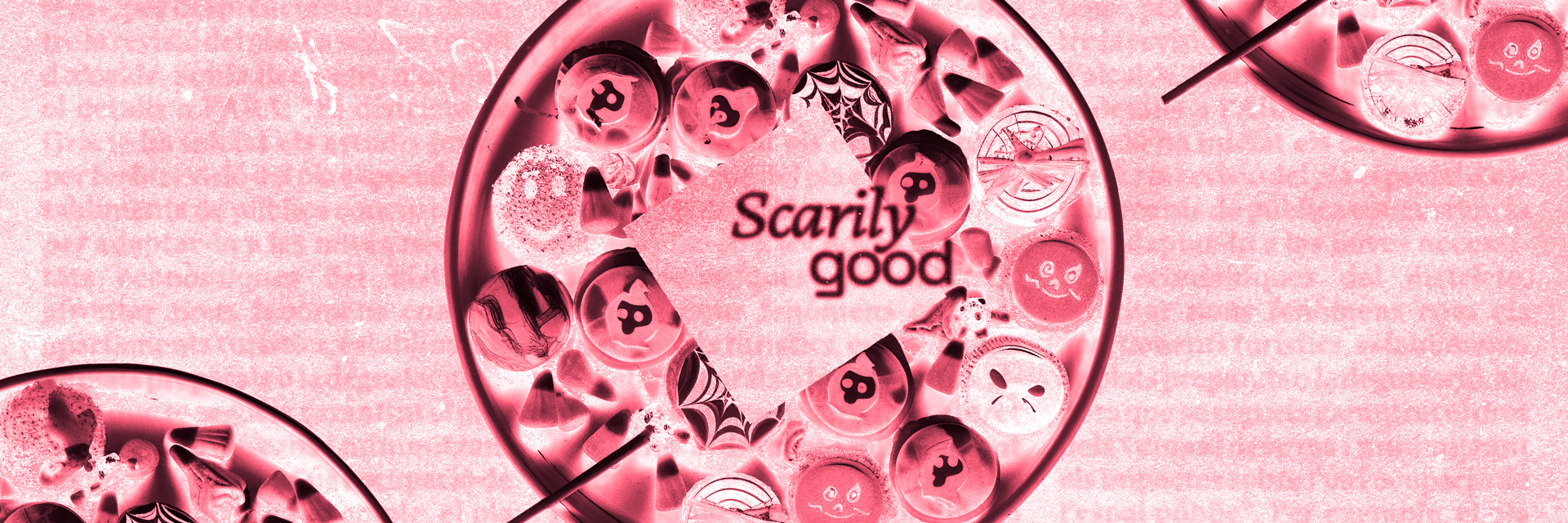
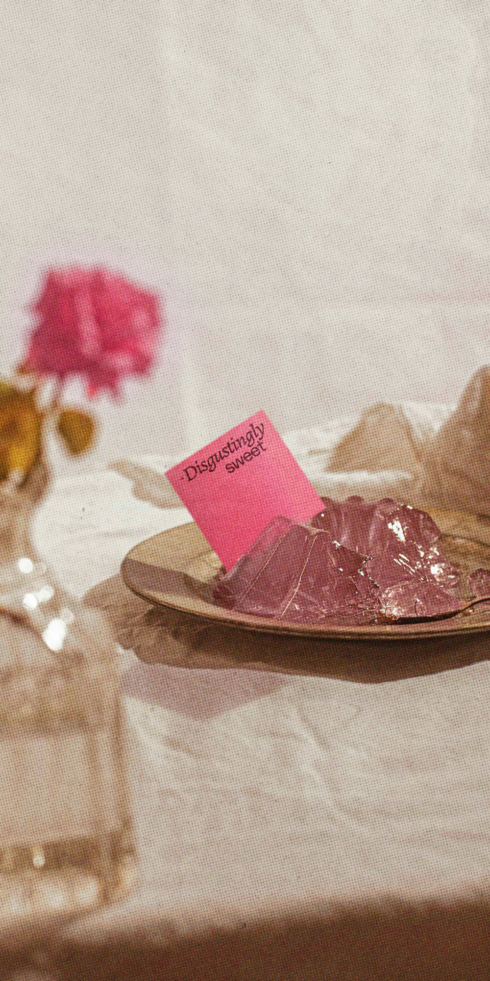
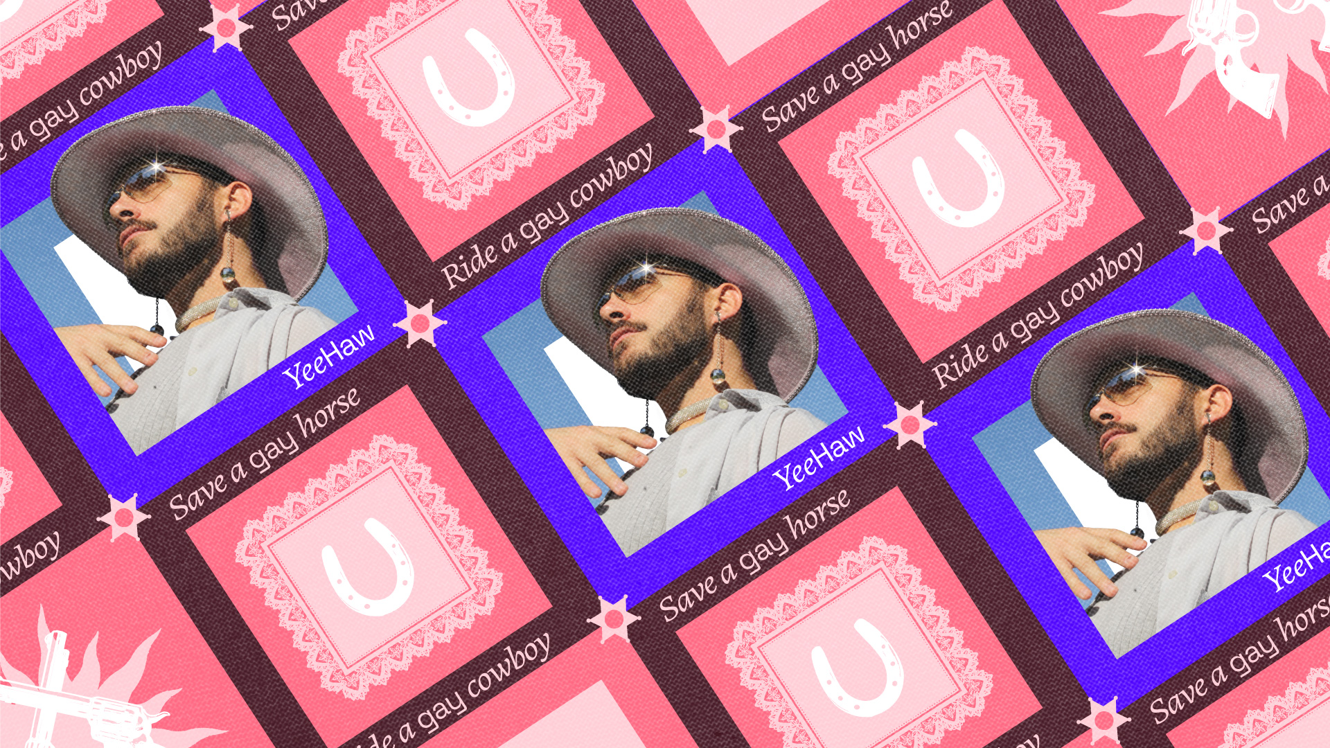
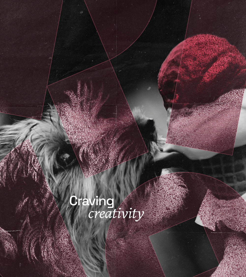
The brand is where the project became really fun. It wasn’t just about shapes and colours, as it was in 2021. Textures, movements and ideas came together to bring to life what the brand was always meant to be. Unapologetic fun, but in a professional way.
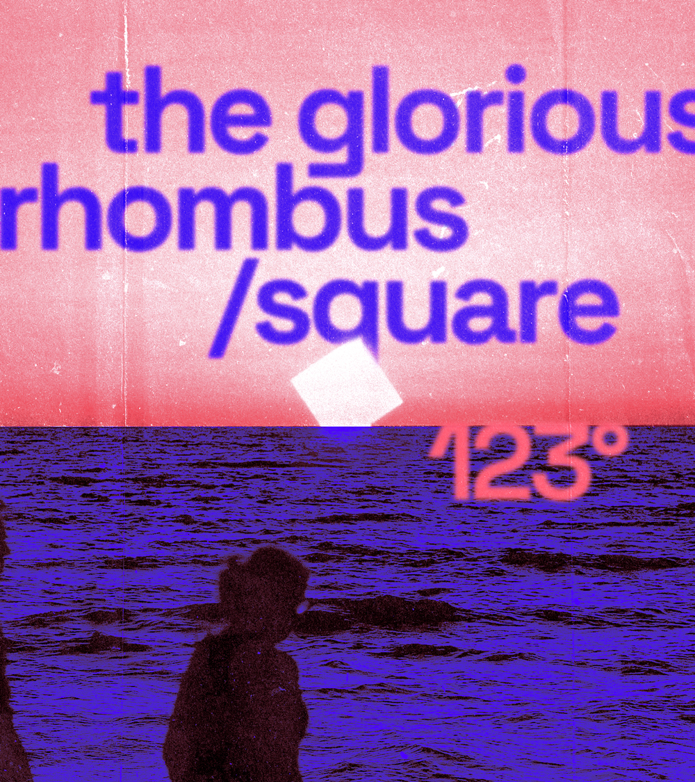
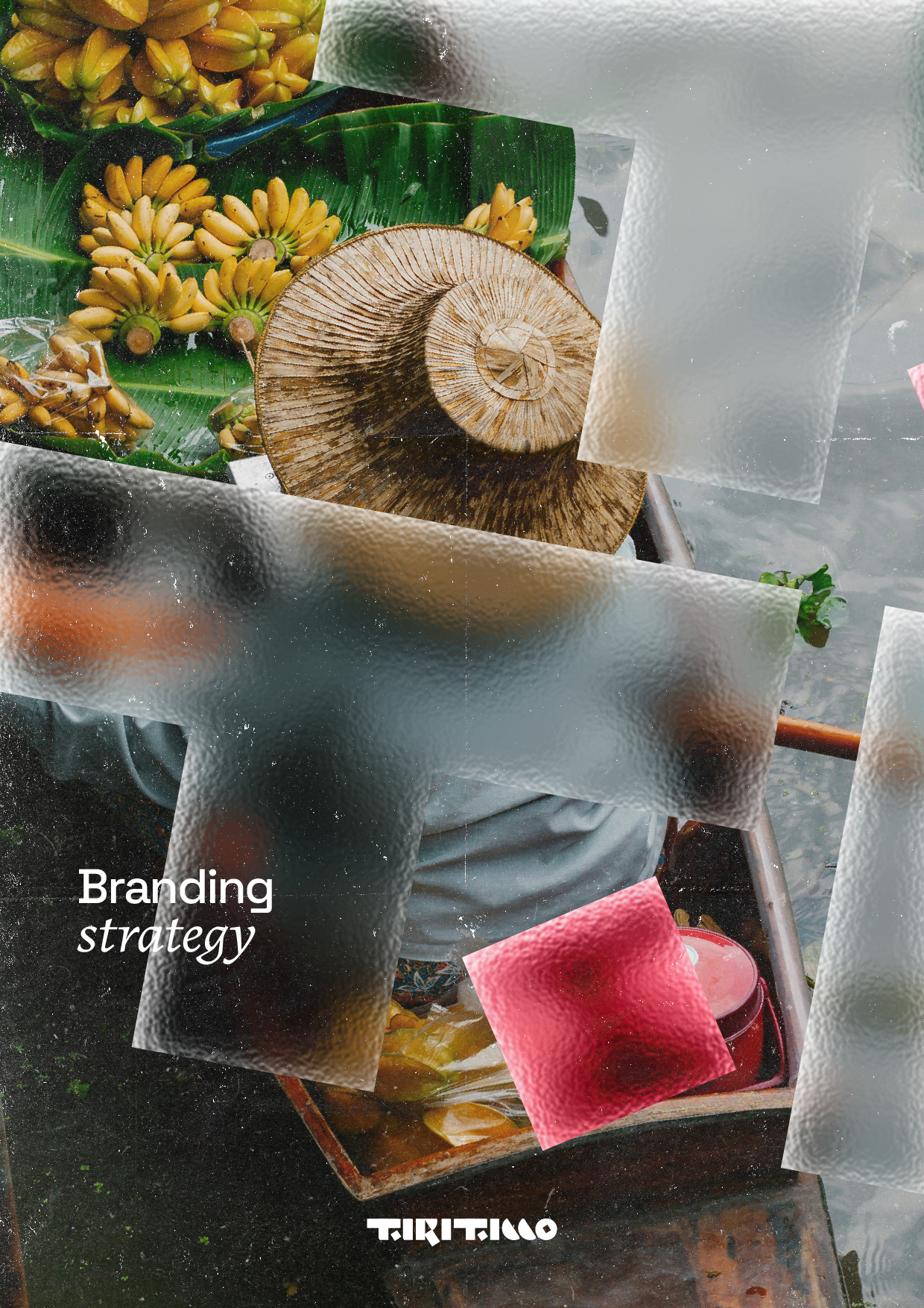
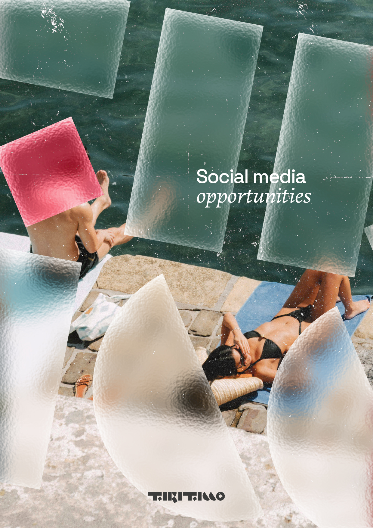
And the visuals are where the brand landed and became more than just theory. It evolved into showing off what the real Ticco had become. A 360° designer. Well, maybe more like 270°. Let’s talk again in 5 years, we’ll get those 90°.