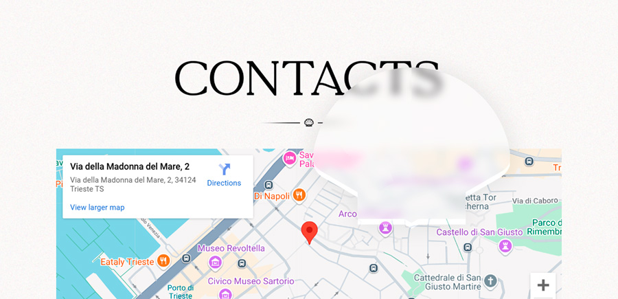
Madreperla Bistrot is an elegant seafood restaurant in Trieste, owned and run by Dunya and Ned. The bistrot blends their passion for décor, atmosphere, and cuisine, creating an environment inspired by antique and Art Deco influences, traditional Japanese illustrations, and consistent references to shells and pearls, which sit at the core of the restaurant’s identity.

Logo
The logo captures the unique identity of the bistrot: a mix of regional and Asian cuisine, a refined and intimate mood, and recurring themes of sea, shells, and pearls.
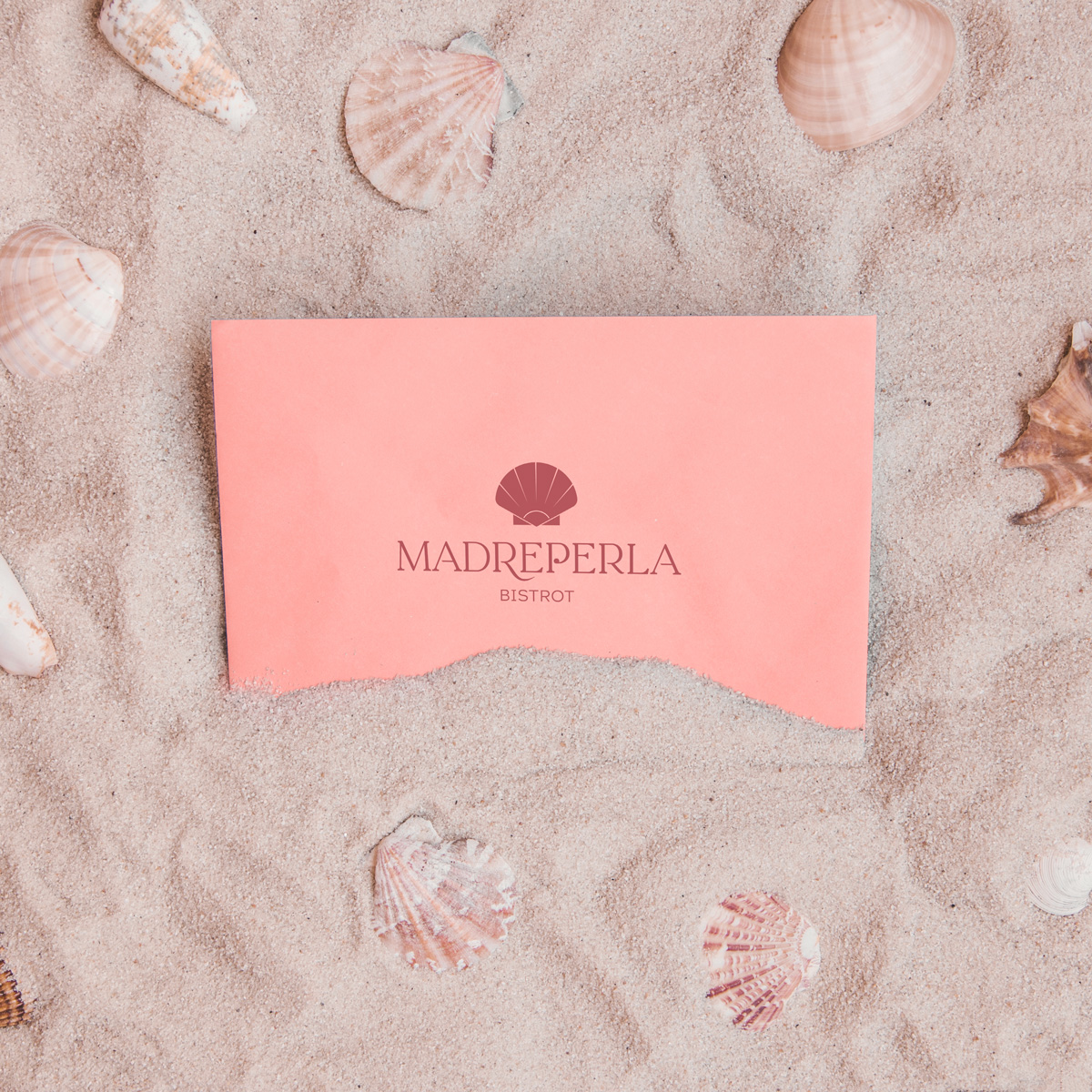

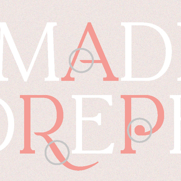
The mark is a stylized shell containing a pearl and a subtle rising sun, referencing both the Far East and Art Deco influences.
The wordmark uses La Luxes Serif, modified to integrate seamlessly with the shell and highlight the pearl detail in the letter P. A two-line version exists for smaller applications, like social media or the website.

Brand
The name “Madreperla” means “mother of pearl” in Italian and serves as a central inspiration for the brand. The challenge was to convey elegance and simplicity while maintaining a distinctive and refined character. Textures play a key role, adding subtle depth and sophistication without overwhelming the design.


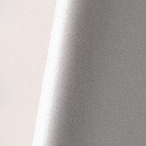
The color palette balances warmth and calm: burnt coral takes the lead, complemented by black, white, and shades of gray, while a soft ice blue provides visual relief and harmony. Gradients and pearlescent effects further strengthen the connection to the pearl theme and the delicate identity of the bistrot.
Typography is an integral part of the brand. Titles are set in La Luxes Serif, offering a distinctive and refined presence. Body text is handled with Work Sans in light italic, while accents use Circular in bold, creating contrast and emphasis where needed.

Socials
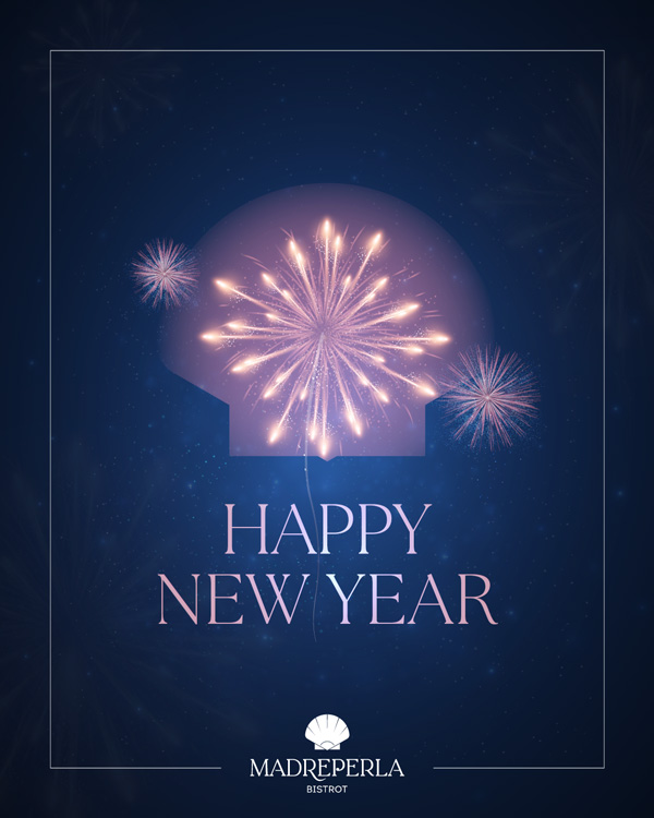
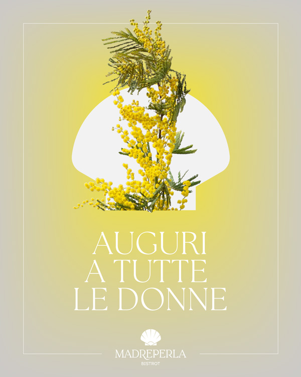
The brand comes to life across social media channels, where its visual language is applied daily. Every post reflects the identity of Madreperla, combining carefully crafted copy with striking graphics. The approach ensures that the brand feels sophisticated yet approachable, connecting with the audience while maintaining a cohesive aesthetic across all platforms.



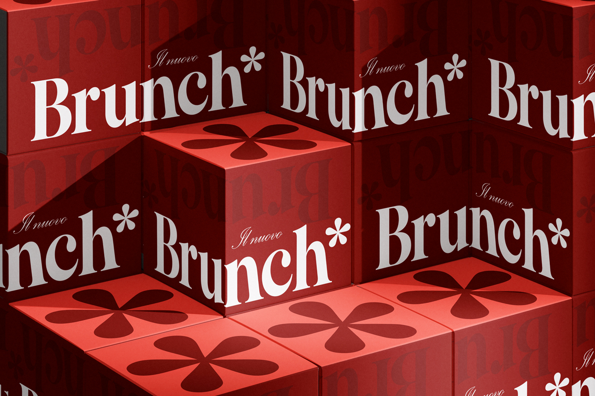
The New Brunch*
The New Madreperla Bistrot Brunch* is fun meets elegant, pop meets classic. Photos play a huge part of the brand, but plain colours balance their busyness to create the warm inviting feel of the New Brunch*.
Check out the project here.

Printed material
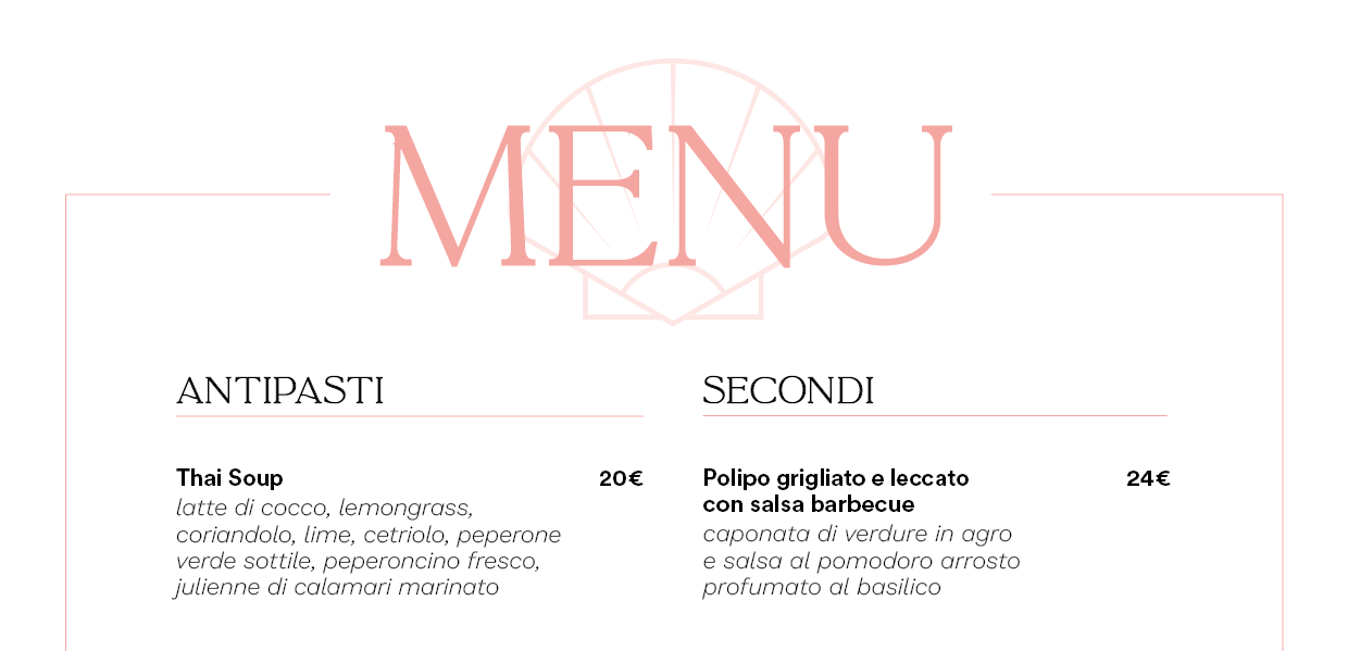
All of the bistrot’s printed touchpoints were carefully designed to reflect the brand’s elegance and refinement. This includes menus, business cards, flyers, and placemats, each crafted to maintain a consistent visual language.
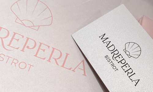
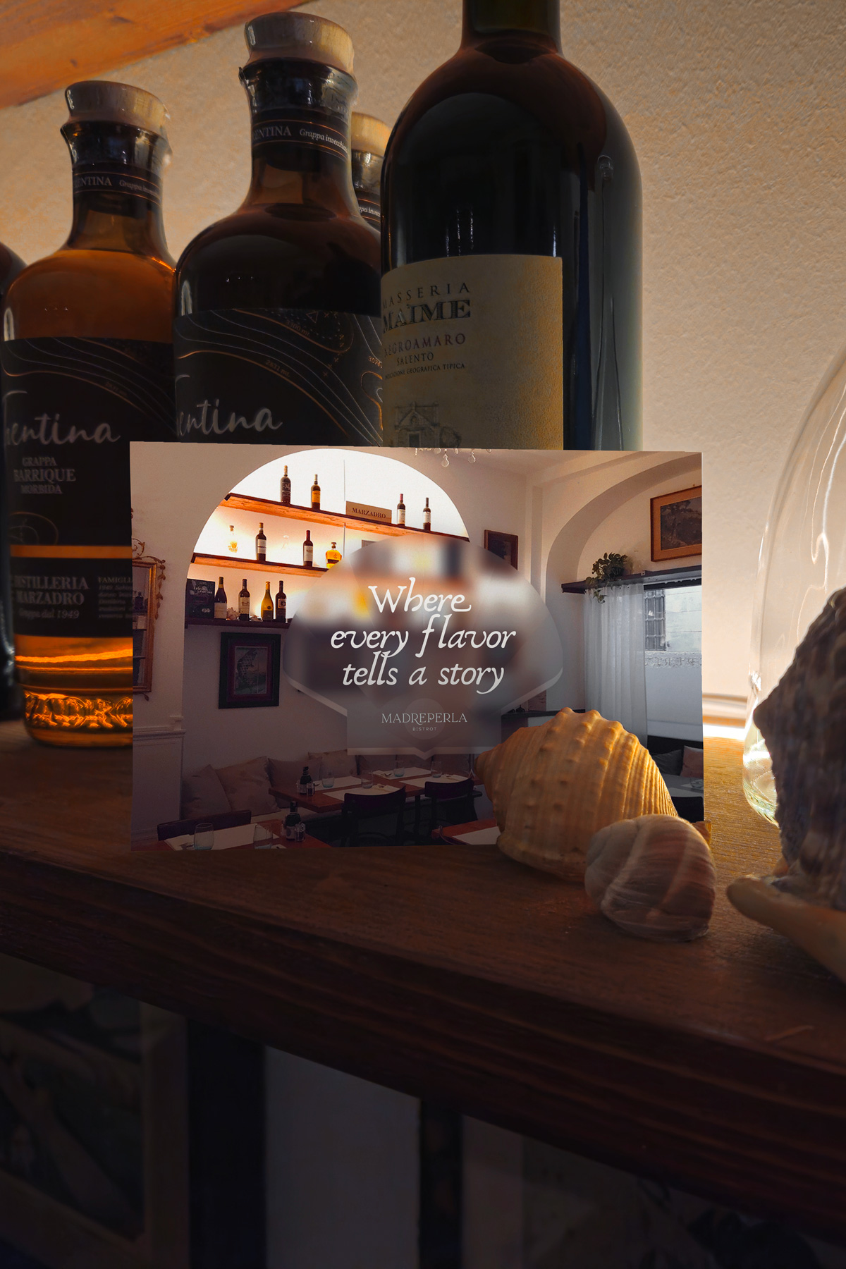
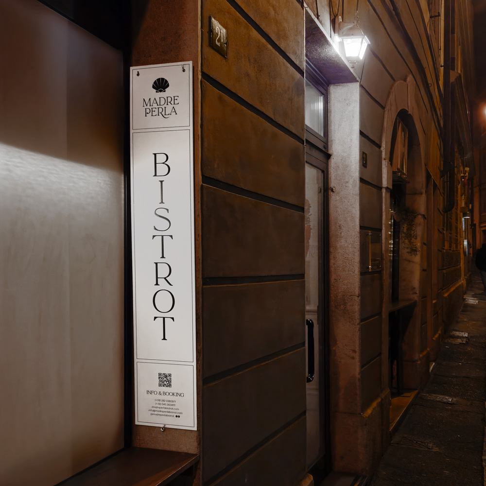
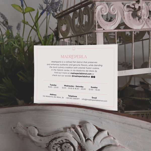
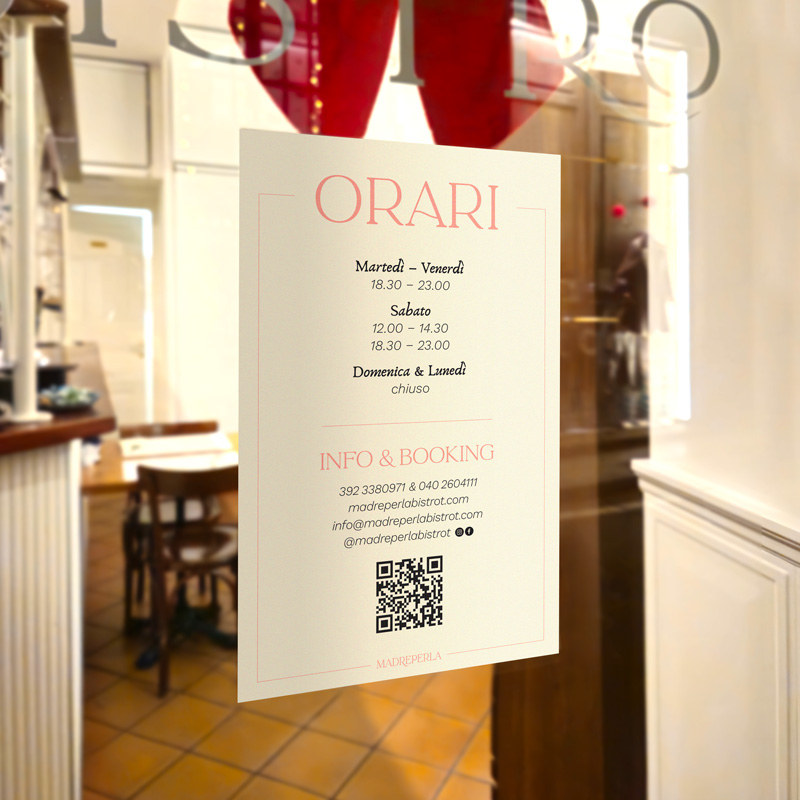
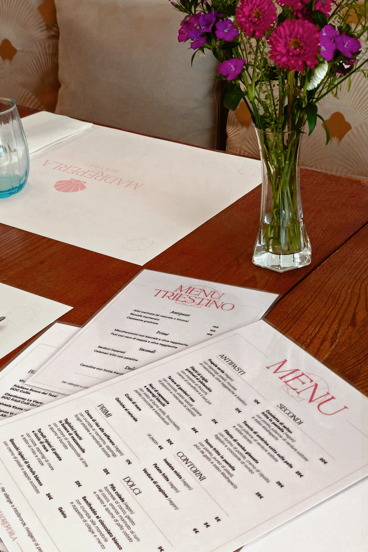
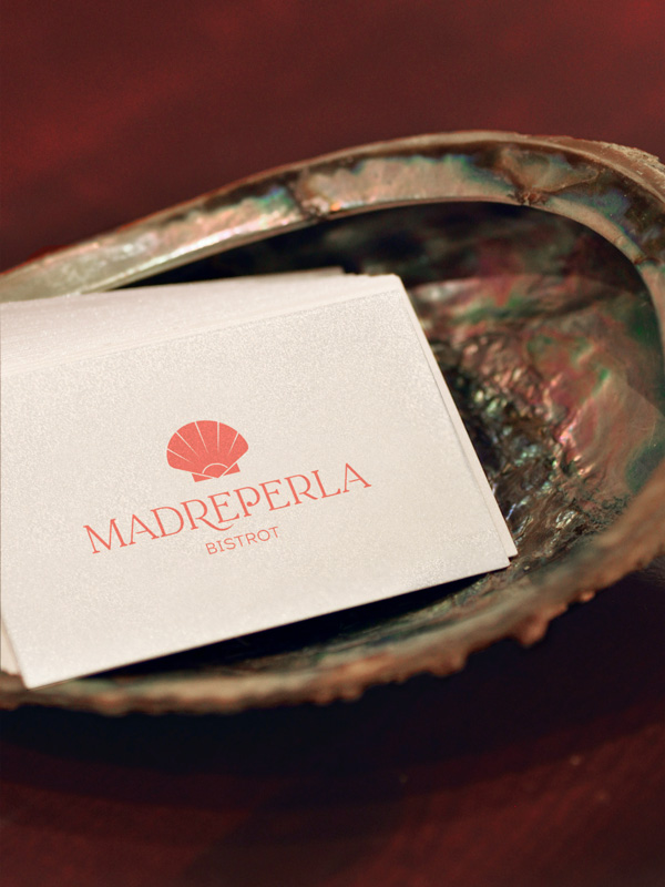
Where possible, pearlescent paper is used, creating a tactile detail that reinforces the connection to the brand’s name and delicate aesthetic. Every element is treated with attention to detail, ensuring that even the smallest printed item communicates the sophisticated identity of Madreperla.


Photography
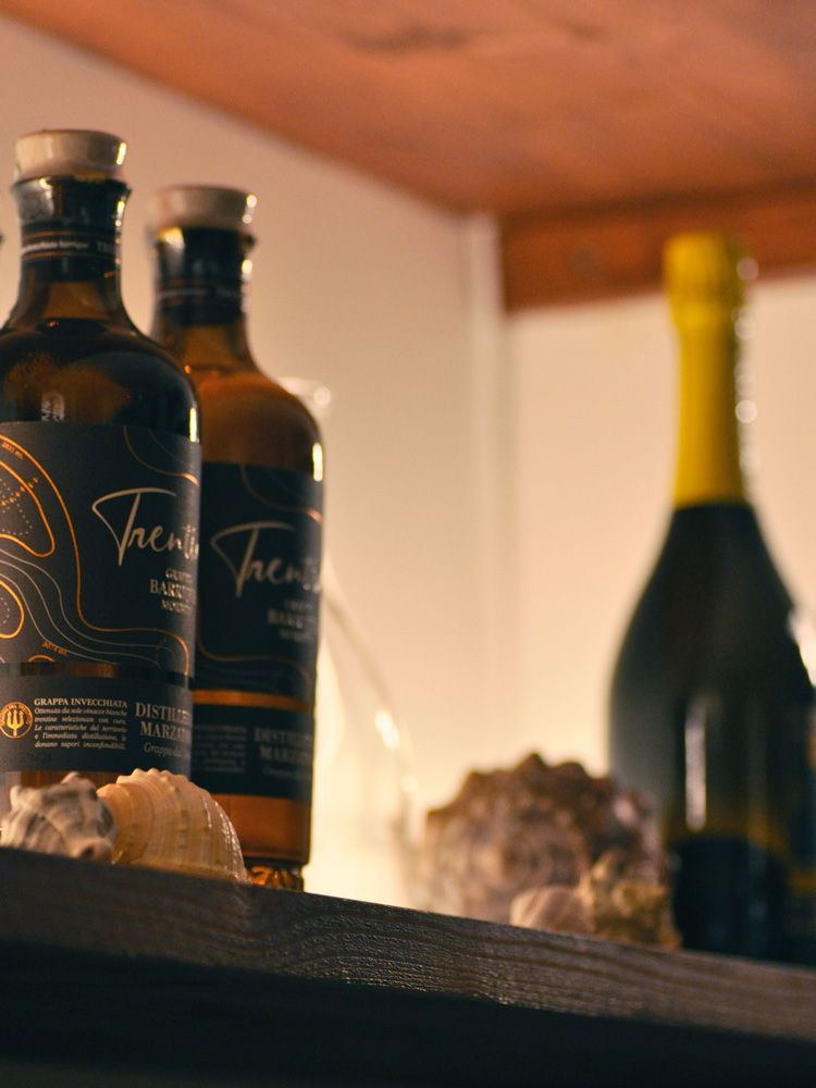
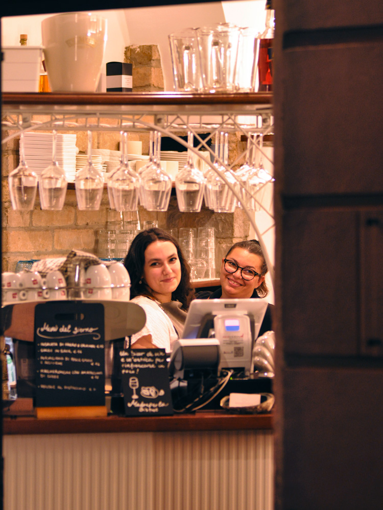
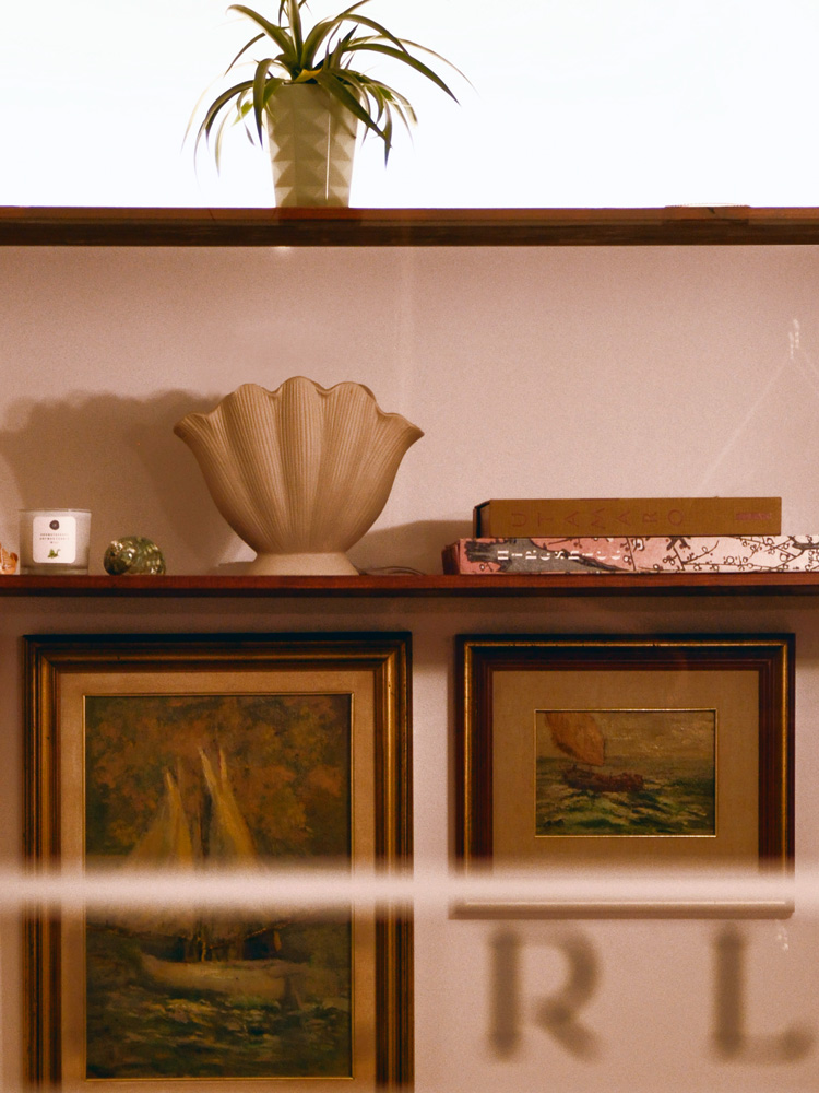
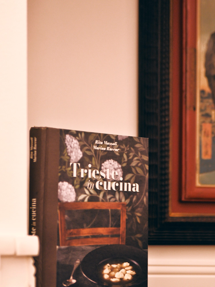
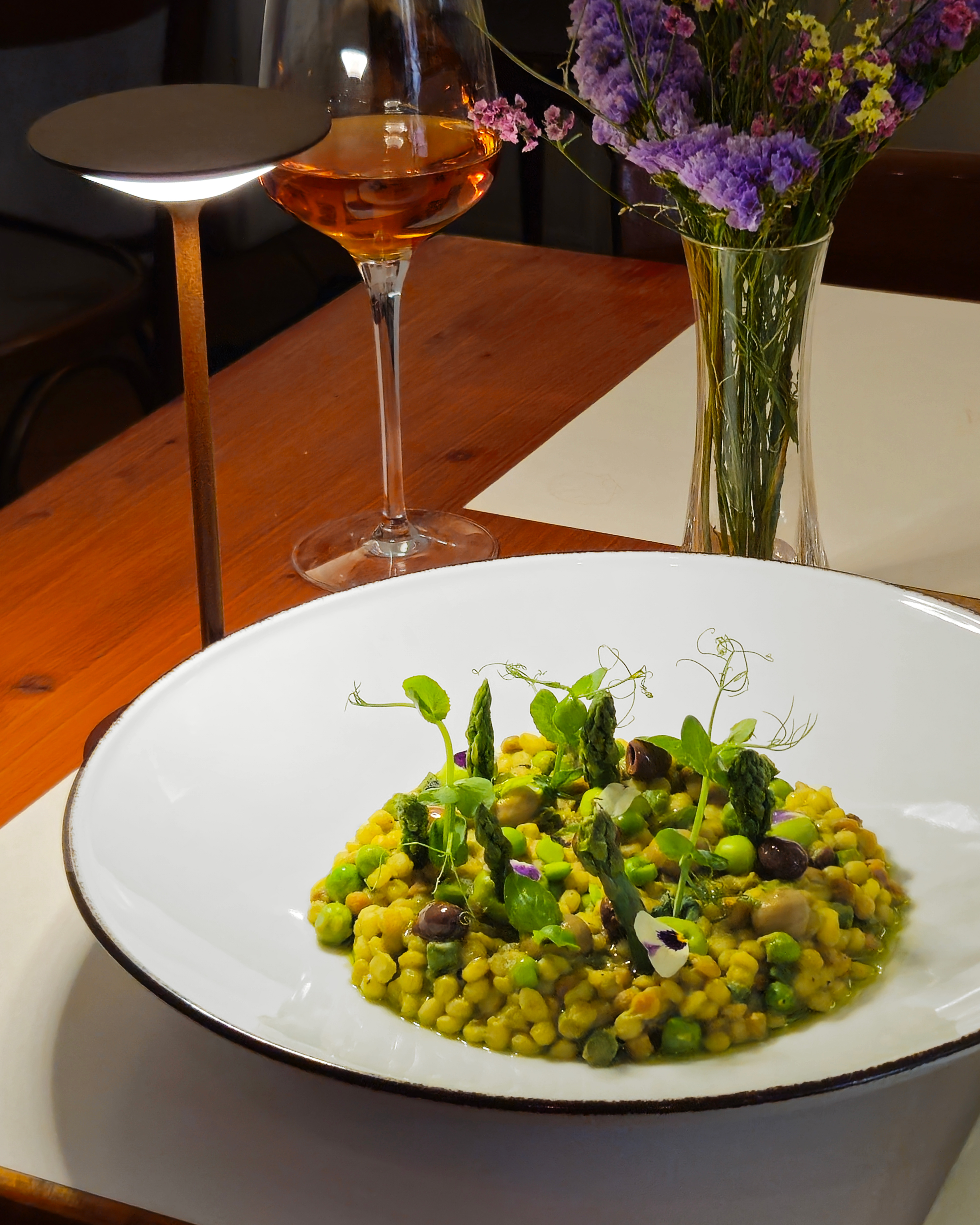
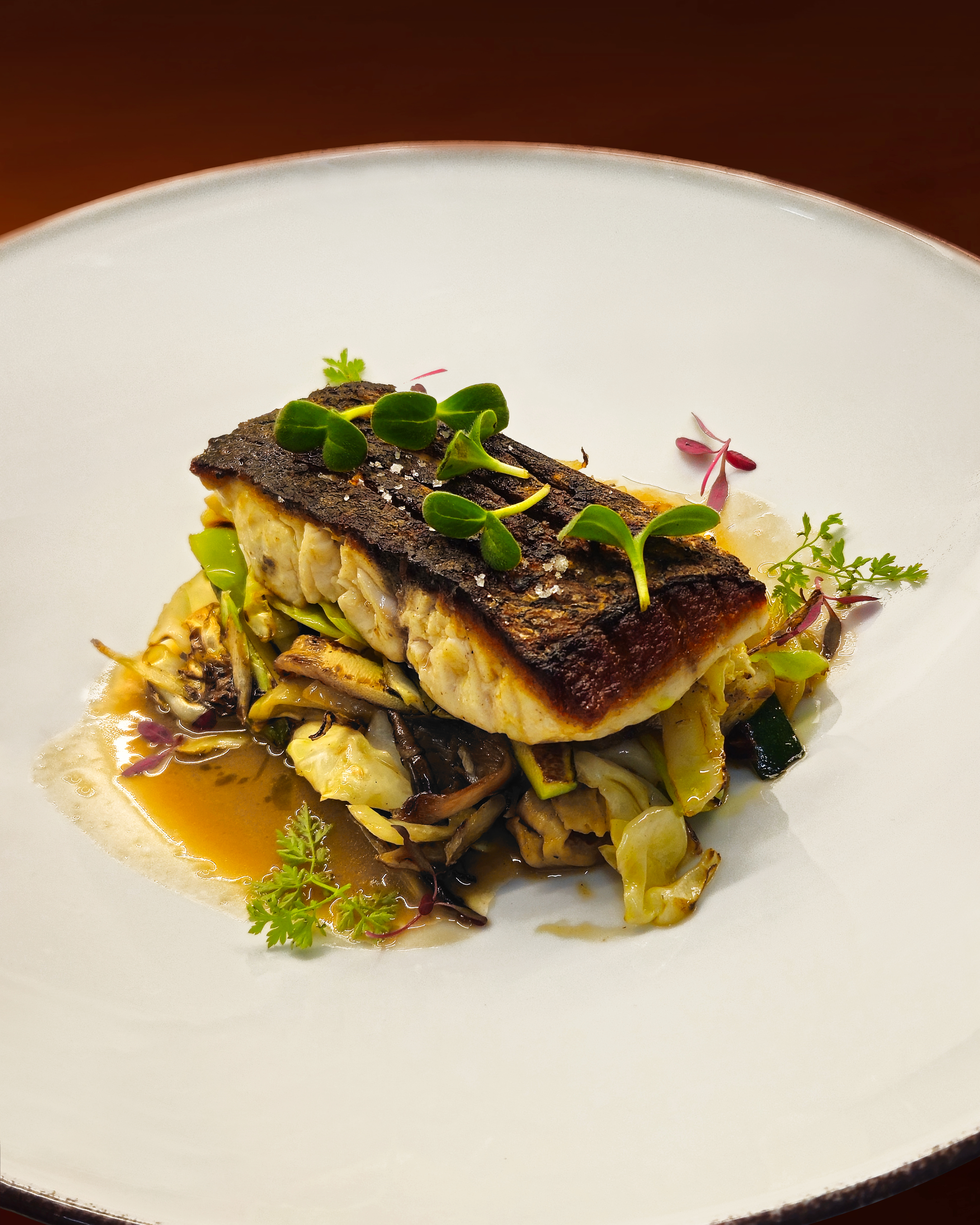
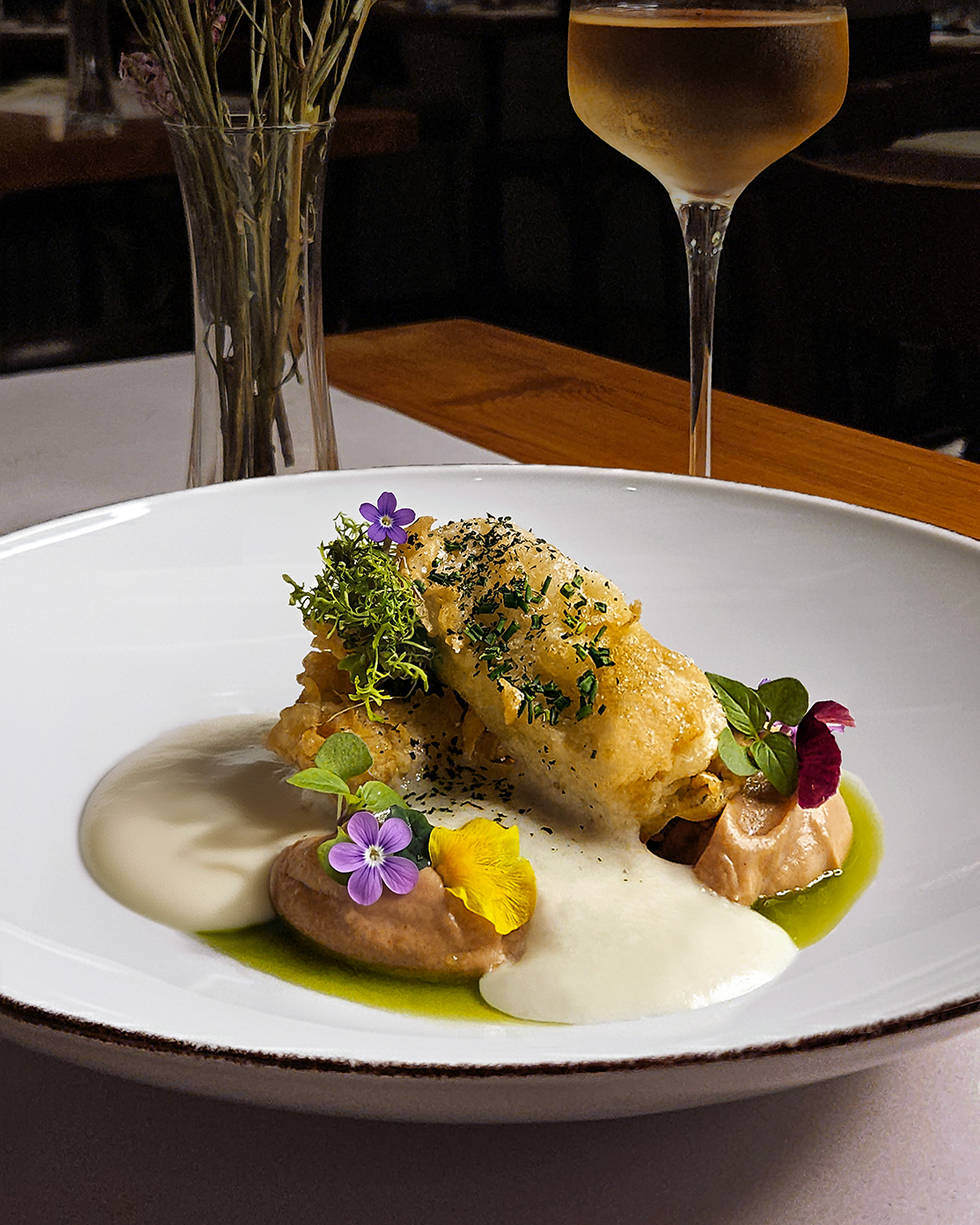
Photography plays a central role in conveying the bistrot’s atmosphere. Images emphasize warm colors and capture atmospheric shots of dishes, as well as details of the décor and interiors. Blurred or lightly lit photos create an intimate and almost magical feel, perfectly reflecting the experience of dining in Madreperla Bistrot. These photos are used mainly on social media and the website, but occasionally on promotional material.

Website
Lastly, I created the website for the bistrot. We aimed for a website that was minimal, clear, and elegant, and I am very pleased with the results.
