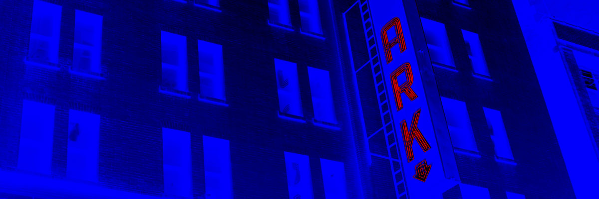
THE LOGO(S)
This personal branding project has been in the making for ages, always evolving.
The logo had to be minimal in order to not steal attention from the artworks.


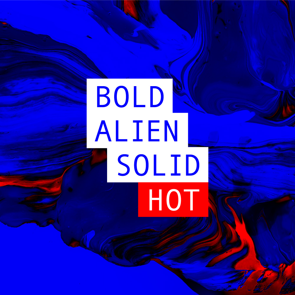
THE BRAND
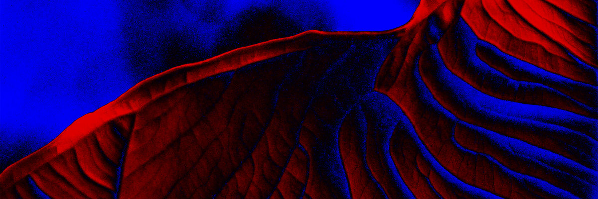
A brand is more than a set of assets: it’s a feeling, it’s ideas. The keywords of the brand are bold, alien, solid, hot. Bold for the colours, alien for the unease these cause, solid for the blocky and flat graphics and the use of wide areas of colour, hot for the red accents as well as for the overall saturation.


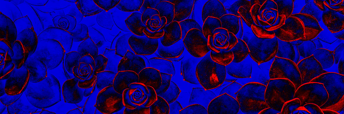
THE STATIONERY
As mentioned, colours are used as wide surfaces and are almost form-free.
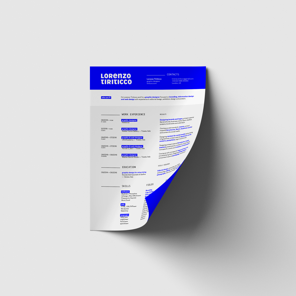

THE WEBSITE
The website (yes, the one you’re on) coveys the strength of the brand but in a subtler and more elegant way.

The website was built from the ground up, with the mobile always on mind.
