Change is a natural part of life. And in a few years I’ve evolved soooo much, personally and professionally. Having studied branding, I’ve realised how fundamental it is for a brand to really reflect the product, the company or, in this case, the person. This is why I knew that my personal branding deserved a deep overhaul. Check out my old brand here. Enjoy the new Lorenzo Ticco Tiriticco!
The brand
I used to think I needed to be somebody I’m not in professional situations. Having advanced in my work life, I’ve realised I need to be honest and proud of what makes me unique.

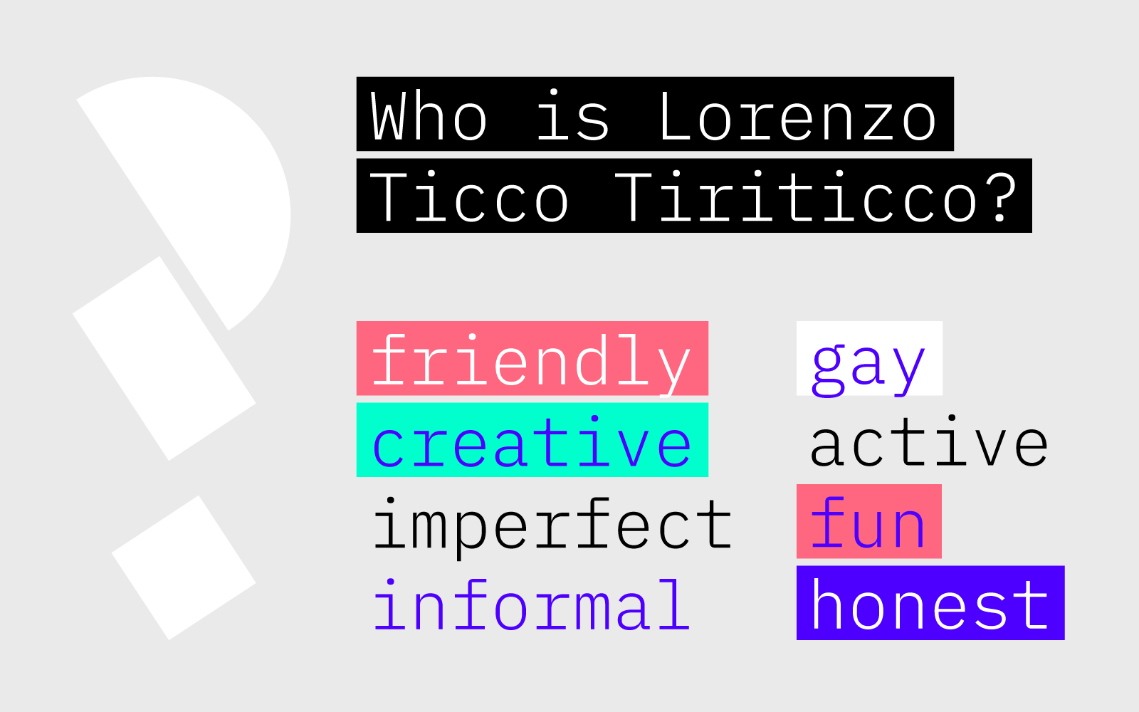
The rebranding started with sitting down and thinking who Lorenzo Ticco Tiriticco is.
After a process of refining, the brand was created, focusing on a few simple concepts: simple, dynamic, colorful and fun.

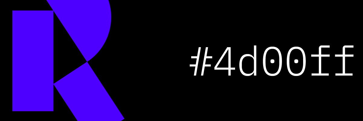
The logos
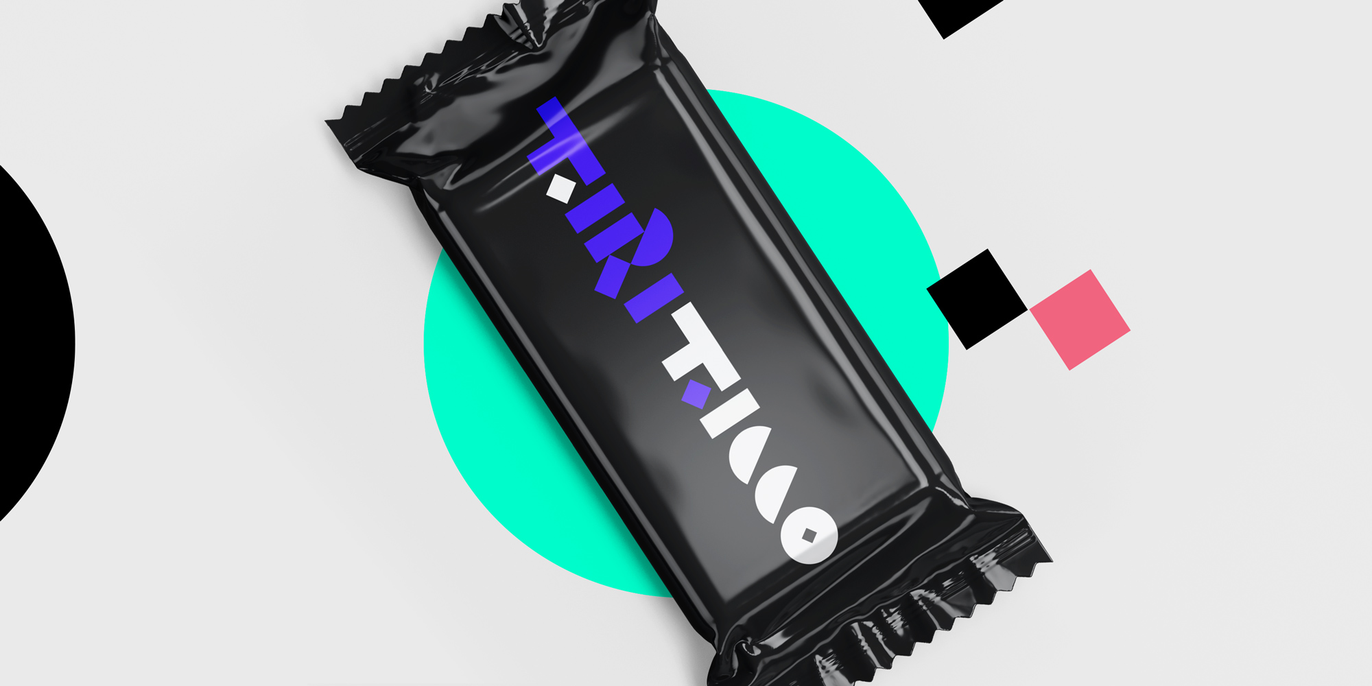
One of my main goals for the logo was to create a dynamic logo, continuing with the idea of dynamism and fun.
Furthermore, the logo was created with fun shapes that can be used throughout the brand.

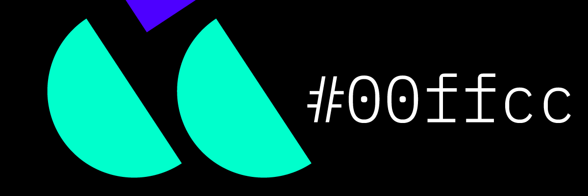
The visuals
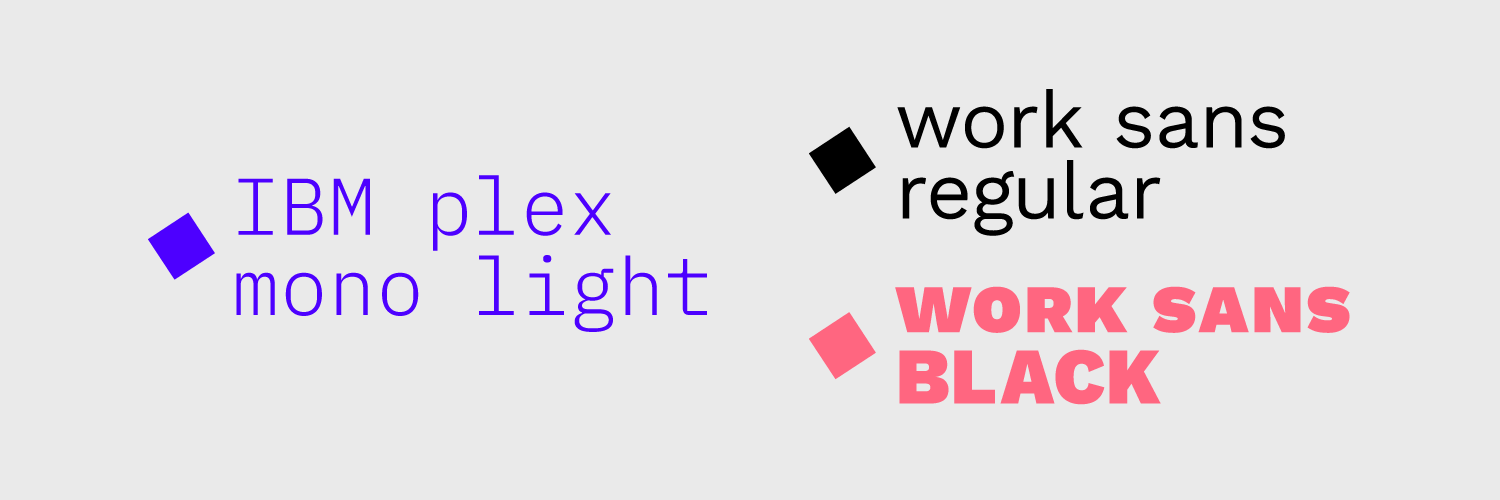
Developing a brand, my goal is to find simple and effective ways to convey the values of the brand.
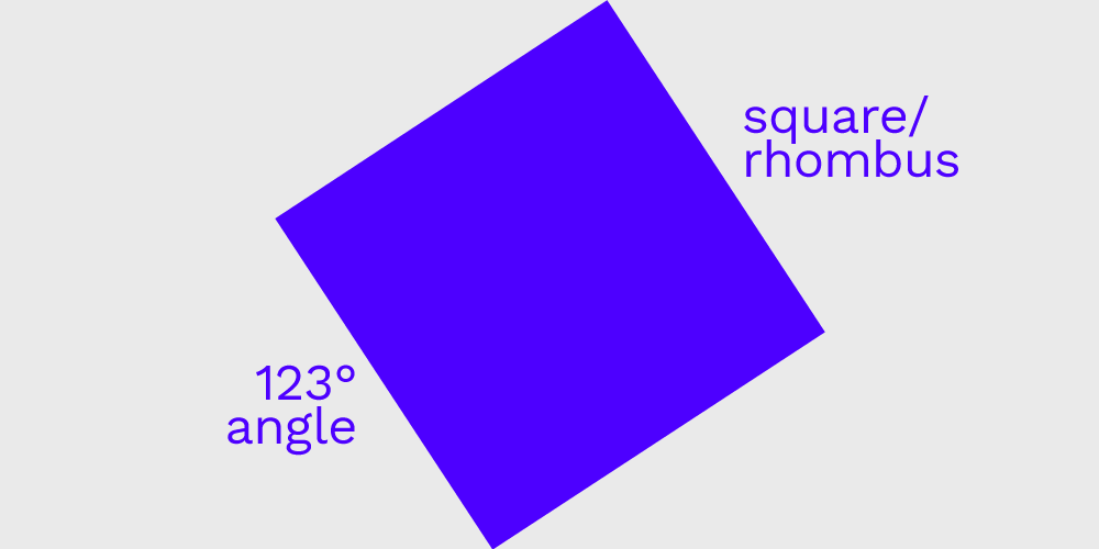
In my case, geometry and vivid colors are consistent both with me as a person and as a graphic designer (check out my “anti-climactic” project). Custom shapes, unique colors and a specific angle offer a lot to play with, compared to my previous branding, that came off as too serious and hostile.


The illustrations